

基础 Widgets
重要概念
一切皆组件。Flutter 所有的元素都是由组件组成。比如一个布局元素、一个动画、一个装饰效果等。
容器 Container
容器组件 Container 包含一个子 widget ,自身具备 alignment 、padding 等属性 ,方便布局过程中摆放 child 。
属性
| 属性名 | 类型 | 说明 |
|---|---|---|
| key | Key | 控制一个小部件如何替换树中的另一个小部件 |
| alignment | AlignmentGeometry | 将孩子与容器内的对齐,如果 Container或者 Container 的父节点尺寸大于 child 的尺寸,该属性设置会起作用,有很多种对齐方式。 |
| child | Widget | 容器所包含的孩子 |
| constraints | BoxConstraints | 添加到child上额外的约束条件 |
| decoration | Decoration | 绘制在child后面的修饰,设置了Decoration的话,就不能设置color属性,否则会报错,此时应该在Decoration中进行颜色的设置 |
| foregroundDecoration | Decoration | 绘制在child前面的装饰 |
| margin | EdgeInsetsGeometry | 围绕在 Decoration 和 child 之外的空白区域,不属于内容区域 |
| padding | EdgeInsetsGeometry | Decoration 内部的空白区,如果有 child ,child 位于 padding 内部。 |
| transform | Matrix4 | 设置 Container 的变换矩阵,类型为Matrix4 |
- padding 与 margin 的不同之处:padding 是包含在 Content 内,而 margin 是外部边界。设置点击事件的话,padding 区域会响应,而 margin 区域不会响应。
简单示例
import 'package:flutter/material.dart';
void main() => runApp(MaterialApp(
title: 'container 示例',
home: HomePage(),
));
class HomePage extends StatelessWidget {
@override
Widget build(BuildContext context) {
return Center(
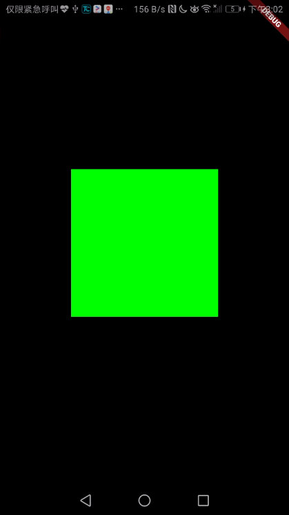
child: Container(
margin: const EdgeInsets.all(10.0),
color: const Color(0xFF00FF00),
width: 200.0,
height: 200.0,
),
);
}
}
import 'package:flutter/material.dart';
void main() => runApp(MaterialApp(
title: 'container 示例',
home: HomePage(),
));
class HomePage extends StatelessWidget {
@override
Widget build(BuildContext context) {
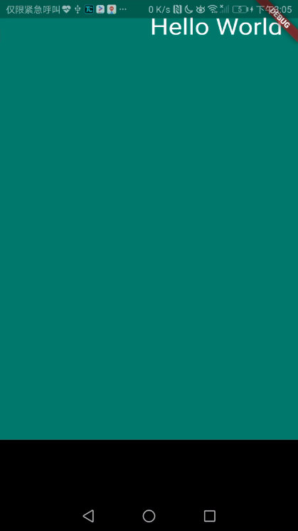
return Container(
constraints: BoxConstraints.expand(
height: Theme.of(context).textTheme.display1.fontSize * 1.1 + 200.0,
),
padding: const EdgeInsets.all(20.0),
color: Colors.teal.shade700,
alignment: Alignment.topRight,
child: Text('Hello World', style: Theme.of(context).textTheme.display1.copyWith(color: Colors.white)),
foregroundDecoration: BoxDecoration(
image: DecorationImage(
image: NetworkImage('https://www.example.com/images/frame.png'),
centerSlice: Rect.fromLTRB(270.0, 180.0, 1360.0, 730.0),
),
),
transform: Matrix4.rotationX(0.5),
);
}
}
行 Row
在水平方向上排列子 widget 的列表
| 属性 | 类型 | 说明 |
|---|---|---|
| key | Key | 控制一个小部件如何替换树中的另一个小部件 |
| children | List | 树中此小部件下方的小部件 |
| crossAxisAlignment | CrossAxisAlignment | 如何将孩子对齐 |
| direction | Axis | 用作主轴的方向 |
简单示例
import 'package:flutter/material.dart';
void main() => runApp(MaterialApp(
home: HomePage(),
));
class HomePage extends StatelessWidget {
@override
Widget build(BuildContext context) {
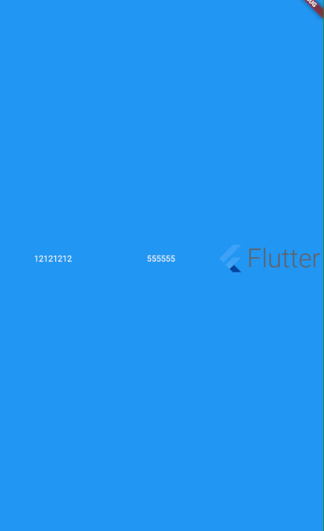
return Scaffold(
backgroundColor: Colors.blue,
body: Center(
child: Row(
children: <Widget>[
Expanded(
child: Text(
'12121212 ',
textAlign: TextAlign.center,
style: TextStyle(color: Colors.white),
),
),
Expanded(
child: Text(
'555555',
textAlign: TextAlign.center,
style: TextStyle(color: Colors.white),
),
),
Expanded(
child: FittedBox(
fit: BoxFit.contain, // otherwise the logo will be tiny
child: const FlutterLogo(
style: FlutterLogoStyle.horizontal,
),
),
),
],
),
));
}
}
列 Column
在垂直方向上排列子widget的列表
属性
| 属性 | 类型 | 说明 |
|---|---|---|
| key | Key | 控制一个小部件如何替换树中的另一个小部件 |
| children | List | 树中此小部件下方的小部件 |
| crossAxisAlignment | CrossAxisAlignment | 如何将孩子对齐 |
| direction | Axis | 用于方向 |
| mainAxisAlignment | MainAxisAlignment | 主轴方向上的对齐方式,会对child的位置起作用,默认是start |
| mainAxisSize | MainAxisSize | 在主轴方向占有空间的值,默认是max |
| textDirection | TextDirection | 确定水平放置孩子的顺序以及如何解释水平方向的开始和结束 |
| verticalDirection | VerticalDirection | 确定垂直放置孩子的顺序以及如何解释垂直方向的开始和结束 |
简单示例
import 'package:flutter/material.dart';
void main() => runApp(MaterialApp(
home: HomePage(),
));
class HomePage extends StatelessWidget {
@override
Widget build(BuildContext context) {
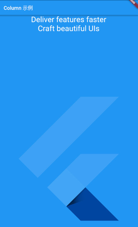
return Scaffold(
backgroundColor: Colors.blue,
appBar: AppBar(
title: Text('Row 示例'),
),
body: Center(
child: Column(
crossAxisAlignment: CrossAxisAlignment.center,
children: <Widget>[
Text('Deliver features faster',style: TextStyle(color: Colors.white,fontSize: 30.0),),
Text('Craft beautiful UIs',style: TextStyle(color: Colors.white,fontSize: 30.0),),
Expanded(
child: FittedBox(
alignment: Alignment.bottomRight,
child: const FlutterLogo(),
),
),
],
),
));
}
}
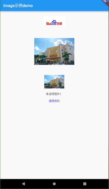
图像 Image
显示图像的 Widget
构造函数
| 构造函数 | 说明 |
|---|---|
| Image() | 通用方法,使用 ImageProvider 实现,如下方法本质上也是使用的这个方法 |
| Image.asset(String name,{}) | 根据资源名字,加载一张资源图片 |
| Image.file(File file,{}) | 给定一个图片文件,加载一张本地文件图片 |
| Image.memory(Uint8List bytes,{}) | 从 Uint8List 获取 ImageStream,加载一张内存中的图片 |
| Image.network(String src,{}) | 给定一个 URL,加载一张网络图片 |
属性
| 属性 | 类型 | 说明 |
|---|---|---|
| key | Key | 控制一个小部件如何替换树中的另一个小部件 |
| alignment | AlignmentGeometry | 如何在图像范围内对齐图像 |
| centerSlice | Rect | 当图片需要被拉伸显示的时候,centerSlice 定义的矩形区域会被拉伸,可以理解成我们在图片内部定义来一个点 9 文件用作拉伸 |
| color | Color | 如果不为 null,则使用 colorBlendMode 将此 Color 与每个图像像素混合 |
| colorBlendMode | BlendMode | 用于将 Color 与此图像组合 |
| excludeFromSemantics | bool | 是否从 Semantics 排除此图像 |
| filterQuality | FilterQuality | 用于设置图像的滤清器质量 |
| fit | BoxFit | 对图像显示的控制 |
| gaplessPlayback | bool | 当图像提供者更改时,是继续显示旧图像(true)还是简单地显示任何内容(false) |
| height | double | |
| image | ImageProvider | 要显示的图像 |
| matchTextDirection | bool | 是否在 TextDirection 的方向上绘制图像 |
| repeat | ImageRepeat | 如何绘制图像未覆盖的布局边界的任何部分 |
| semanticLable | String | |
| width | double |
简单示例
import 'dart:io';
import 'dart:math';

import 'package:flutter/material.dart';
import 'package:flutter/rendering.dart';
import 'dart:typed_data';

import 'package:flutter/services.dart';
import 'package:image_picker/image_picker.dart';

void main() => runApp(MyApp());

//assets/images/tzd.jpg
class MyApp extends StatelessWidget {
  @override
  Widget build(BuildContext context) {
//    debugPaintSizeEnabled = true;
    return MaterialApp(
      home: Scaffold(
        appBar: AppBar(
          title: Text('Image示例demo'),
        ),
        body: Center(
          child: Column(
            children: <Widget>[
              //加载网络图片
              Image.network(
                'https://www.baidu.com/img/bd_logo1.png?where=super',
                width: 100.0,
                height: 100.0,
              ),

              //加载Assets
              Image.asset(
                'assets/images/tzd.jpg',
                width: 200.0,
                height: 200.0,
              ),

              //Memory
              MemoryImageWidget(),

              //从文件加载图片
              FileImageWidget(),
            ],
          ),
        ),
      ),
    );
  }
}

class FileImageWidget extends StatefulWidget {
  @override
  _FileImageWidgetState createState() => _FileImageWidgetState();
}

class _FileImageWidgetState extends State<FileImageWidget> {
  File _image;

  Future getImge() async {
    var image = await ImagePicker.pickImage(source: ImageSource.gallery);
    setState(() {
      _image = image;
    });
  }

  @override
  Widget build(BuildContext context) {
    return Column(
      children: <Widget>[
        Center(
          child: _image == null
              ? Text('未选择图片!')
              : Image.file(
                  _image,
                  width: 200.0,
                  height: 200.0,
                ),
        ),
        FlatButton(
          onPressed: getImge,
          child: Text(
            '选择图片',
            style: TextStyle(
              color: Color(0xff0000ff),
            ),
          ),
        ),
      ],
    );
  }
}

//stf StatefulWidget快捷键, stl StatelessWidget快捷键
class MemoryImageWidget extends StatefulWidget {
  @override
  _MemoryImageWidgetState createState() => _MemoryImageWidgetState();
}

class _MemoryImageWidgetState extends State<MemoryImageWidget> {
  Uint8List bytes;

  @override
  void initState() {
    super.initState();
    rootBundle.load('assets/images/tzd.jpg').then((data) {
      if (mounted) {
        setState(() {
          bytes = data.buffer.asUint8List();
        });
      }
    });
  }

  @override
  Widget build(BuildContext context) {
    final _decoration = BoxDecoration(
      image: bytes == null ? null : DecorationImage(image: MemoryImage(bytes)),
    );
    return Container(
      width: 100.0,
      height: 100.0,
      decoration: _decoration,
    );
  }
}
文字 Widget Text
单一格式演示的文本
属性
| 属性 | 类型 | 说明 |
|---|---|---|
| key | Key | 控制一个小部件如何替换树中的另一个小部件 |
| data | String | 要显示的文字 |
| locale | Locale | 用于在可以以不同方式呈现相同Unicode字符时选择字体,具体取决于区域设置 |
| maxLines | int | 文本要跨越的可选最大行数,必要时包装。如果文本超过给定的行数,则会根据溢出将其截断 |
| overFlow | TextoverFlow | 如何处理视觉溢出 |
| semanticsLable | String | 此文本的替代语义标签 |
| softWrap | bool | 文本是否应该在软换行符处中断 |
| strutStyle | StrutStyle | 要使用的支柱风格。 Strut样式定义了strut,它设置了最小垂直布局度量 |
| style | TextStyle | 如果为非null,则为此文本使用的样式 |
| textAlign | TextAlign | 文本应如何水平对齐 |
| textScaleFactor | double | 每个逻辑像素的字体像素数。 |
| textSpan | TextSpan | 要显示为TextSpan的文本 |
| textDirection | TextDirection | 文本的方向性 |
简单示例
Text(
            'Hello, How are you111111111111111111111111111111111111111111111111111111111111111111111111111111?',
            textAlign: TextAlign.center,
            overflow: TextOverflow.ellipsis, //显示省略号
            style: TextStyle(fontWeight: FontWeight.bold),
          )
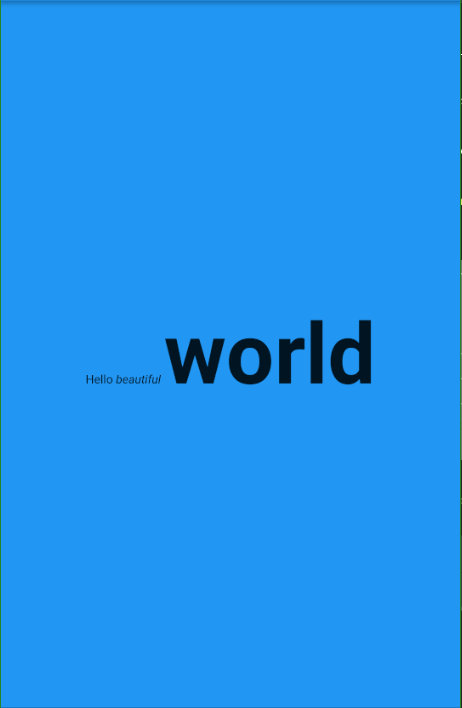
const Text.rich(
            TextSpan(
              text: 'Hello', // default text style
              children: <TextSpan>[
                TextSpan(text: ' beautiful ', style: TextStyle(fontStyle: FontStyle.italic)),
                TextSpan(text: 'world', style: TextStyle(fontWeight: FontWeight.bold,fontSize: 100.0)),
              ],
            ),
          )
图标 Icon
一个图形图标 Widget,使用 IconData 中描述的字体(如图标中的材料预定义 IconDatas)中的字形绘制
属性
| 属性 | 类型 | 说明 |
|---|---|---|
| color | Color | 绘制图标使用的 Color |
| icon | IconData | 要显示的图标。图标库 Icons 中有可用的图标 |
| semanticLable | String | 标志位 |
| size | double | 大小 |
| textDirection | TextDirection | 绘制方向,一般使用不到 |
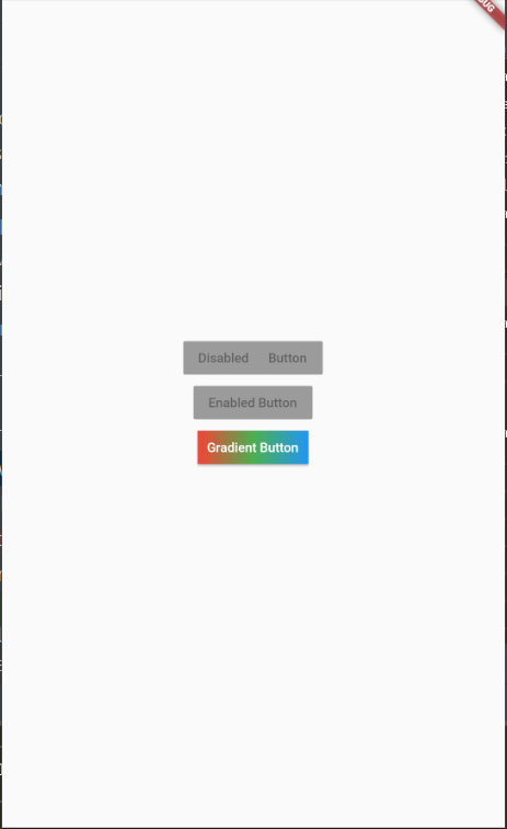
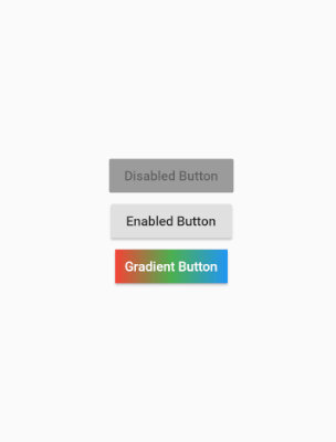
凸起来的按钮 RaisedButton
Material Design 中的 button, 一个凸起的材质矩形按钮 ,它可以响应按下事件,并且按下时会带一个触摸效果。
属性
| 属性名 | 类型 | 默认值 | 说明 |
|---|---|---|---|
| color | Color | null | 组件的 Color |
| disabledColor | Color | ThemeData.disabledColor | 组件禁用状态的 Color ,默认为主题里的禁用 Color ,也可以设置为其他 Color |
| onPressed | VoidCallback | null | 当按钮按下时会触发此回调事件 |
| child | Widget | - | 按钮的child通常为一个Text文本组件,用来显示按钮的文本 |
| enable | bool | true | 按钮是否为禁用状态 |
RaisedButton(
              onPressed: null,
    		//  onPressed: (){},
              child: const Text('Disabled      Button'),
            ),
脚手架 Scaffold
Material Design 布局结构的基本实现。此类提供了用于显示 drawer、snackbar 和底部 sheet 的API
属性
| 属性 | 类型 | 说明 |
|---|---|---|
| appBar | PreferredSizeWidget | 一个应用栏,显示在脚手架的顶部 |
| backgroundColor | Color | 作为整个脚手架基础的材质小部件的 Color |
| body | Widget | 支架的主要内容 |
| bottomNavigationBar | Widget | 底部导航栏显示在脚手架的底部 |
| bottomSheet | widget | 要显示的持久性底部工作表 |
| drawer | widget | 显示在身体侧面的面板,通常隐藏在移动设备上。从左到右( TextDirection.ltr )或从右到左( TextDirection.rtl )滑入 |
| drawerDragStartBebavior | DragStartBehavior | 确定处理拖动开始行为的方式 |
| endDrawer | Widget | 显示在身体侧面的面板,通常隐藏在移动设备上。从右到左( TextDirection.ltr )或从左到右( TextDirection.rtl )滑动 |
| floatingActionButton | Widget | 显示在身体上方的按钮,位于右下角 |
| floatingActionButtonAnimator | FloatingActionButtonAnimator | Animator 将 floatingActionButton 移动到新的floatingActionButtonLocation。 |
| floatingActionButtonLocation | FloatingActionButtonLocation | 负责确定 floatingActionButton 的去向 |
| persistentFooterButtons | List | 一组显示在脚手架底部的按钮 |
| primary | bool | 此脚手架是否显示在屏幕顶部 |
| resizeToAvoidBottomInset | bool | 如果为 true ,则 body 和 scaffold 的浮动小部件应自行调整大小,以避免屏幕键盘的高度由环境MediaQuery 的 MediaQueryData.viewInsets 底部属性定义 |
| resizeToAvoidBottomPadding | bool | 不推荐使用此标志,请改用resizeToAvoidBottomInset |
简单示例
import 'package:flutter/material.dart';

void main() => runApp(MaterialApp(
      home: HomePage(),
    ));

class HomePage extends StatelessWidget {
  @override
  Widget build(BuildContext context) {
    return Scaffold(
      body: Center(
        child: Column(
          mainAxisSize: MainAxisSize.min,
          children: <Widget>[
            RaisedButton(
              onPressed: null,
              child: const Text('Disabled      Button'),
            ),
            RaisedButton(
              onPressed: null,
              child: const Text('Enabled Button'),
            ),
            RaisedButton(
              onPressed: () {},
              textColor: Colors.white,
              padding: const EdgeInsets.all(0.0),
              child: Container(
                decoration: const BoxDecoration(
                  gradient: LinearGradient(
                    colors: <Color>[Colors.red, Colors.green, Colors.blue],
                  ),
                ),
                padding: const EdgeInsets.all(10.0),
                child: Text('Gradient Button'),
              ),
            ),
          ],
        ),
      ),
    );
  }
}
Material Components Widgets → App结构和导航
脚手架 Scaffold
Scaffold 实现了基本的 Material Design 布局。只要是在 Material Design 中定义过的单个界面显示的布局组件元素,都可以使用 Scaffold 来绘制。
参考基础 Widget → Scaffold
应用按钮组件 Appbar
应用按钮组件有 AppBar 和 SliverAppBar 。它们是 Material Design 中的 AppBar ,也就是Android 中的 ToolBar 。 AppBar 和 SliverAppBar 都继承自 StatefulWidget ,两者的区别在于 AppBar 的位置是固定在应用最上面的;而 SliverAppBar 是可以跟随内容滚动的。
常用属性
| 属性名 | 类型 | 默认值 | 说明 |
|---|---|---|---|
| actions | List | null | 要在标题 widget 后显示的widget |
| automaticallyImplyLeading | bool | false | 控制是否应该尝试暗示前导widget 为null |
| backgroundColor | Color | ThemeData.primaryColor | 用于应用栏材质的 Color 。通常这应该与亮度,iconTheme ,textTheme 一起设置 |
| bottom | PreferredSizeWidget | null | 此小部件显示在应用栏的底部 |
| bottomOpacity | double | 应用栏底部的不透明程度 | |
| brightness | Brightness | ThemeData.primaryColorBrightness | 应用栏材质的亮度。通常,这与backgroundColor,iconTheme,textTheme一起设置。 |
| centerTitle | bool | false | 标题是否应该居中 |
| elevation | double | 4 | 将此应用栏相对于其父级放置的 z 坐标 |
| flexibleSpace | Widget | null | 此小组件堆叠在工具栏和标签栏后面。它的高度与应用栏的整体高度相同 |
| iconTheme | IcomThemData | ThemeData.primaryIconTheme | 用于应用栏图标的 Color ,不透明度和大小。通常,这与backgroundColor,brightness,textTheme一起设置 |
| leading | Widget | null | 要在标题之前显示的小部件 |
| preferredSize | Size | 高度为kToolbarHeight和底部窗口小部件首选高度之和的大小 | |
| primary | bool | 此应用栏是否显示在屏幕顶部 | |
| textTheme | TextTheme | ThemeData.primaryTextTheme | 应用栏中用于文本的排版样式。通常,这与亮度backgroundColor,iconTheme一起设置 |
| title | Widget | null | appbar中显示的主要小部件 |
| titleSpacing | double | 横轴上标题内容周围的间距。即使没有前导内容或操作,也会应用此间距。如果希望title占用所有可用空间,请将此值设置为 0.0 | |
| toolbarOpacity | double | 应用栏的工具栏部分是多么不透明 |
简单示例
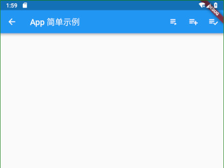
 AppBar(
        leading: Icon(Icons.arrow_back),
        title: Text('App 简单示例'),
        actions: <Widget>[
          IconButton(
            icon: Icon(Icons.playlist_play),
            tooltip: 'Air it',
            onPressed: (){},
          ),
          IconButton(
            icon: Icon(Icons.playlist_add),
            tooltip: 'Restitch it',
            onPressed: (){},
          ),
          IconButton(
            icon: Icon(Icons.playlist_add_check),
            tooltip: 'Repair it',
            onPressed: (){},
          ),
        ],
      ),
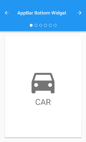
AppBar 加深学习 Sample 1
// Copyright 2017 The Chromium Authors. All rights reserved.
// Use of this source code is governed by a BSD-style license that can be
// found in the LICENSE file.

import 'package:flutter/material.dart';

class AppBarBottomSample extends StatefulWidget {
  @override
  _AppBarBottomSampleState createState() => new _AppBarBottomSampleState();
}

class _AppBarBottomSampleState extends State<AppBarBottomSample> with SingleTickerProviderStateMixin {
  TabController _tabController;

  @override
  void initState() {
    super.initState();
    _tabController = new TabController(vsync: this, length: choices.length);
  }

  @override
  void dispose() {
    _tabController.dispose();
    super.dispose();
  }

  void _nextPage(int delta) {
    final int newIndex = _tabController.index + delta;
    if (newIndex < 0 || newIndex >= _tabController.length)
      return;
    _tabController.animateTo(newIndex);
  }

  @override
  Widget build(BuildContext context) {
    return new MaterialApp(
      home: new Scaffold(
        appBar: new AppBar(
          title: const Text('AppBar Bottom Widget'),
          leading: new IconButton(
            tooltip: 'Previous choice',
            icon: const Icon(Icons.arrow_back),
            onPressed: () { _nextPage(-1); },
          ),
          actions: <Widget>[
            new IconButton(
              icon: const Icon(Icons.arrow_forward),
              tooltip: 'Next choice',
              onPressed: () { _nextPage(1); },
            ),
          ],
          bottom: new PreferredSize(
            preferredSize: const Size.fromHeight(48.0),
            child: new Theme(
              data: Theme.of(context).copyWith(accentColor: Colors.white),
              child: new Container(
                height: 48.0,
                alignment: Alignment.center,
                child: new TabPageSelector(controller: _tabController),
              ),
            ),
          ),
        ),
        body: new TabBarView(
          controller: _tabController,
          children: choices.map((Choice choice) {
            return new Padding(
              padding: const EdgeInsets.all(16.0),
              child: new ChoiceCard(choice: choice),
            );
          }).toList(),
        ),
      ),
    );
  }
}

class Choice {
  const Choice({ this.title, this.icon });
  final String title;
  final IconData icon;
}

const List<Choice> choices = const <Choice>[
  const Choice(title: 'CAR', icon: Icons.directions_car),
  const Choice(title: 'BICYCLE', icon: Icons.directions_bike),
  const Choice(title: 'BOAT', icon: Icons.directions_boat),
  const Choice(title: 'BUS', icon: Icons.directions_bus),
  const Choice(title: 'TRAIN', icon: Icons.directions_railway),
  const Choice(title: 'WALK', icon: Icons.directions_walk),
];

class ChoiceCard extends StatelessWidget {
  const ChoiceCard({ Key key, this.choice }) : super(key: key);

  final Choice choice;

  @override
  Widget build(BuildContext context) {
    final TextStyle textStyle = Theme.of(context).textTheme.display1;
    return new Card(
      color: Colors.white,
      child: new Center(
        child: new Column(
          mainAxisSize: MainAxisSize.min,
          crossAxisAlignment: CrossAxisAlignment.center,
          children: <Widget>[
            new Icon(choice.icon, size: 128.0, color: textStyle.color),
            new Text(choice.title, style: textStyle),
          ],
        ),
      ),
    );
  }
}

//程序入口
void main() {
  runApp(new AppBarBottomSample());
}
AppBar 加深学习 Sample 2
// Copyright 2017 The Chromium Authors. All rights reserved.
// Use of this source code is governed by a BSD-style license that can be
// found in the LICENSE file.

import 'package:flutter/material.dart';

class TabbedAppBarSample extends StatelessWidget {
  @override
  Widget build(BuildContext context) {
    return new MaterialApp(
      home: new DefaultTabController(
        length: choices.length,
        child: new Scaffold(
          appBar: new AppBar(
            title: const Text('Tabbed AppBar'),
            bottom: new TabBar(
              isScrollable: true,
              tabs: choices.map((Choice choice) {
                return new Tab(
                  text: choice.title,
                  icon: new Icon(choice.icon),
                );
              }).toList(),
            ),
          ),
          body: new TabBarView(
            children: choices.map((Choice choice) {
              return new Padding(
                padding: const EdgeInsets.all(16.0),
                child: new ChoiceCard(choice: choice),
              );
            }).toList(),
          ),
        ),
      ),
    );
  }
}

class Choice {
  const Choice({ this.title, this.icon });
  final String title;
  final IconData icon;
}

const List<Choice> choices = const <Choice>[
  const Choice(title: 'CAR', icon: Icons.directions_car),
  const Choice(title: 'BICYCLE', icon: Icons.directions_bike),
  const Choice(title: 'BOAT', icon: Icons.directions_boat),
  const Choice(title: 'BUS', icon: Icons.directions_bus),
  const Choice(title: 'TRAIN', icon: Icons.directions_railway),
  const Choice(title: 'WALK', icon: Icons.directions_walk),
];

class ChoiceCard extends StatelessWidget {
  const ChoiceCard({ Key key, this.choice }) : super(key: key);

  final Choice choice;

  @override
  Widget build(BuildContext context) {
    final TextStyle textStyle = Theme.of(context).textTheme.display1;
    return new Card(
      color: Colors.white,
      child: new Center(
        child: new Column(
          mainAxisSize: MainAxisSize.min,
          crossAxisAlignment: CrossAxisAlignment.center,
          children: <Widget>[
            new Icon(choice.icon, size: 128.0, color: textStyle.color),
            new Text(choice.title, style: textStyle),
          ],
        ),
      ),
    );
  }
}

void main() {
  runApp(new TabbedAppBarSample());
}
底部导航条 BottomNavigationBar
底部导航条,可以很容易地在tap之间切换和浏览顶级视图
常用属性
| 属性名 | 类型 | 说明 |
|---|---|---|
| currentIndex | int | 当前索引 |
| fixedColor | Color | 选中按钮的 Color 。不指定则使用系统主题 Color |
| iconSize | double | 按钮图形大小 |
| items | List<BottomNavigatorBarItem> | 底部导航栏按钮集。每一项是一个BottomNavigatorBarItem,包含icon图标和title文本 |
| onTap | ValueChanged<int> | 按下按钮的回调事件。需要根据返回的索引设置当前索引 |
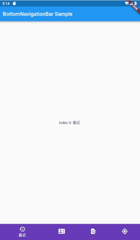
import 'package:flutter/material.dart';
void main()=>runApp(MaterialApp(
  home: HomePage(),
));

class HomePage extends StatefulWidget {
  @override
  _HomePageState createState() => _HomePageState();
}

class _HomePageState extends State<HomePage> {
  int _selectedIndex = 1;
  final _widgetOptions = [
    Text('Index 0: 最近'),
    Text('Index 1: 通讯录'),
    Text('Index 2: 发现'),
    Text('Index 3: 我的'),
  ];


  @override
  Widget build(BuildContext context) {
    return Scaffold(
      appBar: AppBar(
        title: Text('BottomNavigationBar Sample'),
      ),
      body: Center(
        child: _widgetOptions.elementAt(_selectedIndex),
      ),
      bottomNavigationBar: BottomNavigationBar(items: [
        BottomNavigationBarItem(icon: Icon(Icons.history),title:Text('最近'),backgroundColor:Colors.deepPurple),
        BottomNavigationBarItem(icon: Icon(Icons.contact_phone),title:Text('通讯录'),backgroundColor:Colors.deepPurple),
        BottomNavigationBarItem(icon: Icon(Icons.find_in_page),title:Text('发现'),backgroundColor:Colors.deepPurple),
        BottomNavigationBarItem(icon: Icon(Icons.my_location),title:Text('我的'),backgroundColor:Colors.deepPurple),
      ],
        currentIndex: _selectedIndex,
        fixedColor: Colors.deepPurple,
        onTap: (index){
        setState(() {
          _selectedIndex = index;
        });
        },
      ),

    );
  }
}
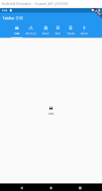
选项卡 TabBar
TabBar 是一个显示水平选项卡的 Material Design 组件,通常需要配套 Tab 选项组件及TabBarView 页面视图组件一起使用。
常用属性
| 属性名 | 类型 | 说明 |
|---|---|---|
| controller | TabController | 这个 widget 的选择和动画状态 |
| dragStartBehavior | DragStartBehavior | 确定处理拖动开始行为的方式 |
| indicatorPadding | EdgeInsetsGeometry | 显示在所选选项卡下方的线条的水平填充。对于 isScrollable 标签栏,指定kTabLabelPadding 会将指示符与 Tab小部件的选项卡文本以及除最短Tab.text 值之外的所有文本对齐 |
| indicator | Decoration | 定义所选选项卡指示器的外观 |
| indicatorColor | Color | 显示在所选选项卡下方的线条 Color 。如果此参数为 null ,则使用 Theme 的indicatorColor 属性的值 |
| indicatorSize | TabBarIndicatorSize | 定义如何计算选定选项卡指示符的大小 |
| indicatorWeight | double | 显示在所选选项卡下方的线条粗细。此参数的值必须大于零 |
| isScrollable | bool | 此选项卡栏是否可以水平滚动 |
| labelColor | Color | 选中 Tab 的 Color |
| labelPadding | TextStyle | 填充添加到每个选项卡标签 |
| onTap | ValueChanged | 点击 TabBar 时调用的可选回调 |
| preferredSize | Size | 高度取决于标签是否同时包含图标和文本的大小 |
| tabs | List | 通常是两个或多个 Tab 小部件的列表 |
| unselectedLabelColor | Color | 未选定标签标签的 Color |
| unselectedLableStyle | TextStyle | 未选定标签标签的文本样式 |
TabBar可用于在TabBarView中显示的页面之间导航。虽然TabBar是一个可以出现在任何地方的普通widget,但它通常包含在应用程序的AppBar中。
通过 AndroidStudio 创建一个新项目,并用下面的代码替换lib/main.dart的内容来尝试运行一下。
简单示例
import 'package:flutter/material.dart';

void main() =>runApp(MaterialApp(home:  HomePage(),));

class HomePage extends StatelessWidget {
  @override
  Widget build(BuildContext context) {
    return DefaultTabController(
        length: choices.length,
        child: Scaffold(
          appBar: AppBar(
            title: Text('TabBar 示例'),
            bottom: new TabBar(
              //tab 支持滑动
                isScrollable: true,
                tabs: choices.map((choice){ //这里相当于 遍历
                  print("遍历:→ "+choice.title);
                  return Tab(
                    text: choice.title,
                    icon: new Icon(choice.icon),
                  );
                }).toList()
            ),
          ),
          body: TabBarView(children: choices.map((item){
            return new Tab(
              text: item.title,
              icon: Icon(item.icon),
            );
          }).toList()),
        ),
    );
  }
}

class Choice {
  const Choice({ this.title, this.icon });
  final String title;
  final IconData icon;
}

const List<Choice> choices = const <Choice>[
  const Choice(title: 'CAR', icon: Icons.directions_car),
  const Choice(title: 'BICYCLE', icon: Icons.directions_bike),
  const Choice(title: 'BOAT', icon: Icons.directions_boat),
  const Choice(title: 'BUS', icon: Icons.directions_bus),
  const Choice(title: 'TRAIN', icon: Icons.directions_railway),
  const Choice(title: 'WALK', icon: Icons.directions_walk),
];
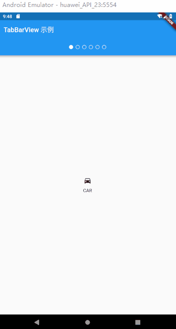
TabBarView
显示与当前选中的选项卡相对应的页面视图。通常和TabBar一起使用
常用属性
| 属性名 | 类型 | 说明 |
|---|---|---|
| children | List | 每个标签的小部件 |
| controller | TabController | 此小部件的选择和动画状态 |
| dragStartBebavior | DragStartBehavior | 确定处理拖动开始行为的方式 |
| physics | ScroolPhysics | 页面视图应如何响应用户输入 |
简单使用
import 'package:flutter/material.dart';
import 'package:flutter/src/scheduler/ticker.dart';

void main() =>runApp(MaterialApp(home:  HomePage(),));

class HomePage extends StatefulWidget {
  @override
  _HomePageState createState() => _HomePageState();
}

class _HomePageState extends State<HomePage> with SingleTickerProviderStateMixin{
  TabController _TabController;
  @override
  void initState() {
    // TODO: implement initState
    super.initState();
    _TabController =  TabController(vsync: this,length: choices.length);
  }
  @override
  void dispose() {
    // TODO: implement dispose
    super.dispose();
    _TabController.dispose();
  }

  void _nextPage(int delta){
   final int newIndex =  _TabController.index + delta;
   if (newIndex < 0 || newIndex >= _TabController.length)
     return;
   _TabController.animateTo(newIndex);
  }

  @override
  Widget build(BuildContext context) {
    // TODO: implement build
    return MaterialApp(
      home: Scaffold(
        appBar: AppBar(
          title: Text('TabBarView 示例'),

            bottom:PreferredSize(child: Theme( data: Theme.of(context).copyWith(accentColor: Colors.white),
                child: Container(
                  height: 50.0,
                  alignment: Alignment.center,
                  child: TabPageSelector(controller: _TabController,),
                )), preferredSize: Size.fromHeight(50.0)) ,
        ),
        body: DefaultTabController(length: choices.length, child:  TabBarView(
            controller: _TabController,
            children: choices.map((item){
          return new Tab(
            text: item.title,
            icon: Icon(item.icon),
          );
        }).toList()),)
      ),

    );
  }
}

class Choice {
  const Choice({ this.title, this.icon });
  final String title;
  final IconData icon;
}

const List<Choice> choices = const <Choice>[
  const Choice(title: 'CAR', icon: Icons.directions_car),
  const Choice(title: 'BICYCLE', icon: Icons.directions_bike),
  const Choice(title: 'BOAT', icon: Icons.directions_boat),
  const Choice(title: 'BUS', icon: Icons.directions_bus),
  const Choice(title: 'TRAIN', icon: Icons.directions_railway),
  const Choice(title: 'WALK', icon: Icons.directions_walk),
];
MaterialApp
MaterialApp 代表使用 Material Design 风格的应用,里面包含了其他所需的基本控件。官方提供的示例 demo 就是从 MaterialApp 这个主组件开始的。
常用属性
| 属性名 | 类型 | 说明 |
|---|---|---|
| title | String | 应用程序的标题。该标题出现在以下位置:Android:任务管理器的程序快照上; IOS:程序切换管理器中 |
| theme | ThemeData | 定义应用所使用的主题 Color ,可以指定主题中每个控件的 Color |
| color | Color | 应用的主要 Color 值,即 primary color |
| home | Widget | 用来定义当前应用打开时所显示的界面 |
| routes | Map<String, WidgetBuilder> | 定义应用中页面跳转规则 |
| initialRoute | String | 初始化路由 |
| onGenerateRoute | RouteFactory | 路由回调函数。当通过Navigator.of(context).pushNamed跳转路由的时候,在routes查找不到时,会调用该方法 |
| onLocaleChanged | - | 当系统修改语言的时候,会触发这个回调 |
| navigatorObservers | List<NavigatorObserver> | 导航观察器 |
| debugShowMaterialGrid | bool | 是否显示布局网格,用来调试UI的工具 |
| showPerformanceOverlay | bool | 显示性能标签 |
设置主页
使用 home 属性设置应用的主页,及整个应用的主组件。
路由处理
routes 对象是一个 Map<String, WidgetBuilder> 。当使用 Navigator.pushNamed 来跳转路由的时候,通过 routes 查找路由名字,然后使用对应的 WidgetBuilder 来构造一个带有页面切换动画的 MaterialPageRoute 。如果应用只有一个界面,则不用设置整个属性,使用 home 即可。
自定义主题
应用程序的主题,各种定制的 Color 都可以设置,用于程序主题切换
WidgetsApp
一个方便的类,它封装了应用程序通常需要的一些widget
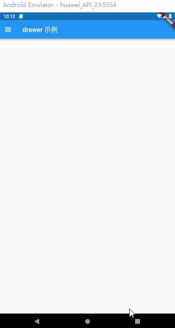
抽屉组件 Drawe
Drawer可以实现类似抽屉拉入推出的效果,通常与ListView组合使用。
常用属性
| 属性名 | 类型 | 默认值 | 说明 |
|---|---|---|---|
| child | Widget | - | Drawer 的 child 可以放置任意可显示的组件 |
| elevation | double | 16 | 阴影尺寸 |
Drawer可以添加头部效果:
- DrawerHeader:展示基本信息
- UserAccountsDrawerHeader:展示用户头像、用户名、Email等信息
DrawerHeader常用属性
| 属性名 | 类型 | 说明 |
|---|---|---|
| decoration | Decoration | header区域的decoration,通常用来设置背景 Color 或背景图片 |
| curve | Curve | 如果decoration发生了变化,则会使用curve设置的变化曲线和duration设置的动画时间来做一个动画效果 |
| child | Widget | Header里面所显示的内容控件 |
| padding | EdgeInsetsGeometry | Header里面内容控件的padding值,如果child为null,该值无效 |
| margin | EdgeInsetsGeometry | Header四周的间隙 |
UserAccountsDrawerHeader常用属性
| 属性名 | 类型 | 说明 |
|---|---|---|
| margin | EdgeInsetsGeometry | Header四周的间隙 |
| decoration | Decoration | header区域的decoration,通常用来设置背景 Color 或背景图片 |
| currentAccountPicture | Widget | 用来设置当前用户的头像 |
| otherAccountsPicture | Widget | 用来设置当前用户其他账号的头像 |
| accountName | Widget | 当前用户的名字 |
| accountEmail | Widget | 当前用户的Email |
| onDetailsPressed | VoidCallback | 当accountName或者accountEmail被点击的时候所触发的回调函数,可以用来显示其他额外的信息 |
简单演示
import 'package:flutter/material.dart';

void main ()=> runApp(MaterialApp(
  home: DrawerWidget(),
));

class DrawerWidget extends StatefulWidget {
  @override
  _DrawerWidgetState createState() => _DrawerWidgetState();
}

class _DrawerWidgetState extends State<DrawerWidget> {
  @override
  Widget build(BuildContext context) {
    return Scaffold(
      appBar: AppBar(
        title: Text('drawer 示例'),
      ),
      drawer: BuildDrawer(),
    );
  }
}

class BuildDrawer extends StatefulWidget {
  @override
  _BuildDrawerState createState() => _BuildDrawerState();
}

class _BuildDrawerState extends State<BuildDrawer> {
  @override
  Widget build(BuildContext context) {
    return Drawer(
      child: ListView(
        children: <Widget>[
          UserAccountsDrawerHeader(
            currentAccountPicture: CircleAvatar(
              backgroundImage: NetworkImage(
                  'https://randomuser.me/api/portraits/women/17.jpg'),
            ),
            accountName: Text('Damon'),
            accountEmail: Text('3262663349@qq.com'),
            otherAccountsPictures: <Widget>[
              Icon(Icons.camera),
            ],
            decoration: BoxDecoration(
              image: DecorationImage(
                image: AssetImage('assets/images/xinqiu.jpg'),
                fit: BoxFit.fill,
              ),
            ),
          ),
          ListTile(
            leading: Icon(Icons.payment),
            title: Text('会员特权'),
          ),
          ListTile(
            leading: Icon(Icons.payment),
            title: Text('会员特权'),
          ),
          ListTile(
            leading: Icon(Icons.payment),
            title: Text('会员特权'),
          ),
          AboutListTile(
            icon: Icon(Icons.error),
            child: Text('关于'),
            applicationName: '哈哈'
            ,applicationVersion: '1.0',
          )
        ],
      ),
    );
  }
}
按钮
RaisedButton
简介
Meaterial Design 中的 Botton , 一个凸起的材质矩形按钮。
常用属性
| 属性名 | 类型 | 说明 |
|---|---|---|
| animationDuration | Duration | 定义形状和高程的动画更改的持续时间 |
| child | Widget | 按钮的标签 |
| clipBehavior | Clip | 根据此选项,内容将被剪裁(或不剪辑) |
| color | Color | 按钮的填充 Color ,由其材料显示,同时处于默认(未按下,已启用)状态 |
| colorBrightness | Brightness | 用于此按钮的主题亮度 |
| disabledColor | Color | 禁用按钮时按钮的填充 Color |
| disabledTextColor | Color | 禁用按钮时用于此按钮文本的 Color |
| elevation | double | 将此按钮相对于其父级放置的z坐标 |
| enabled | bool | 是启用还是禁用按钮 |
| height | double | 按钮的垂直范围 |
| highightColor | Color | 按钮的InkWell的高亮 Color |
| highlightElevation | double | 启用并按下按钮时按钮的材质相对于其父级的高程 |
| materialTapTargetSize | MaterialTapTargetSize | 配置点击目标的最小尺寸 |
| minWidth | double | 按钮占据的最小水平范围 |
| onHighlightChanged | ValueChanged | 由底层 InkWell 小部件的InkWell.onHighlightChanged 回调调用。 |
| onPressed | VoidCallback | 点击或以其他方式激活按钮时调用的回调 |
| padding | EdgeInsetsGeometry | 按钮的孩子的内部填充 |
| shape | ShapeBorder | 按钮材质的形状 |
| splashColor | Clor | 按钮 InkWell 的闪烁 Color |
| textColor | Color | 用于此按钮文本的 Color 。 |
| textTheme | ButtonTextTheme | 定义按钮的 Color ,以及按钮的最小尺寸,内部填充和形状的默认值 |
简单示例
// This sample shows how to render a disabled RaisedButton, an enabled RaisedButton
// and lastly a RaisedButton with gradient background.

import 'package:flutter/material.dart';

void main() => runApp(MyApp());

class MyApp extends StatelessWidget {
  // This widget is the root of your application.
  @override
  Widget build(BuildContext context) {
    return MaterialApp(
      title: 'Flutter Code Sample for material.RaisedButton',
      theme: ThemeData(
        primarySwatch: Colors.blue,
      ),
      home: MyStatelessWidget(),
    );
  }
}

class MyStatelessWidget extends StatelessWidget {
  MyStatelessWidget({Key key}) : super(key: key);

  @override
  Widget build(BuildContext context) {
    return Scaffold(
      body: Center(
        child: Column(
          mainAxisSize: MainAxisSize.min,
          children: <Widget>[
            RaisedButton(
              onPressed: null,
              child: const Text('Disabled Button'),
            ),
            RaisedButton(
              onPressed: () {},
              child: const Text('Enabled Button'),
            ),
            RaisedButton(
              onPressed: () {},
              textColor: Colors.white,
              padding: const EdgeInsets.all(0.0),
              child: Container(
                decoration: const BoxDecoration(
                  gradient: LinearGradient(
                    colors: <Color>[Colors.red, Colors.green, Colors.blue],
                  ),
                ),
                padding: const EdgeInsets.all(10.0),
                child: Text('Gradient Button'),
              ),
            ),
          ],
        ),
      ),
    );
  }
}
FloationgActionButton
简介
一个圆形图标按钮,它悬停在内容之上,以展示应用程序中的主要动作。FloatingActionButton 通常用于 Scaffold.floatingActionButton 字段。
常用属性
| 属性名 | 类型 | 说明 |
|---|---|---|
| backgroudColor | Color | 填充按钮时使用的 Color |
| child | Widget | 树中此小部件下方的小部件 |
| clipBehavior | Clip | 根据此选项,内容将被剪裁(或不剪辑)。 |
| disableElevation | double | 禁用按钮时放置此按钮的 z 坐标( onPressed 为 null) |
| elevation | double | 用于将此按钮与其父按钮相关联的z坐标 |
| foregroudColor | Color | 默认图标和文本 Color 。 |
| heroTag | Object | 要应用于按钮的Hero小部件的标记 |
| highlightElevation | double | 当用户触摸按钮时,将此按钮相对于其父按钮放置的z坐标 |
| isExtended | bool | 如果这是一个“扩展”浮动操作按钮,则为 True |
| materialTapTargetSize | MaterialTapTargetSize | 配置点击目标的最小尺寸 |
| mini | bool | 控制此按钮的大小 |
| onPressed | VoidCallback | 点击或以其他方式激活按钮时调用的回调 |
| shape | ShapeBorder | 按钮材质的形状 |
| tooltip | String | 描述按下按钮时将发生的操作的文本 |
简单示例
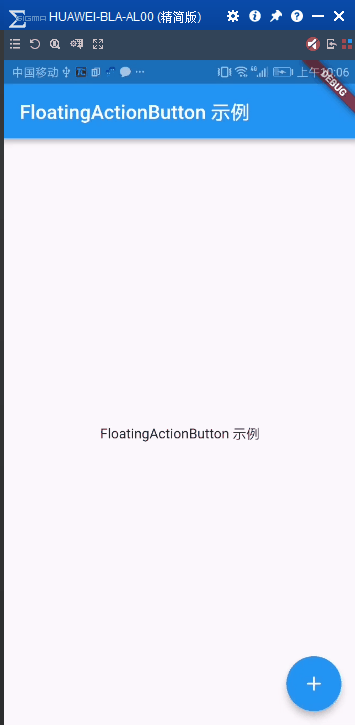
      home: Scaffold(
        appBar: AppBar(
          title: Text('FloatingActionButton 示例'),
        ),
        body: Center(child: Text('FloatingActionButton 示例'),),
        floatingActionButton: FloatingActionButton(
            child: Icon(Icons.add),
            onPressed: (){}),

      ),
FlatButton
简介
一个扁平的 Material 按钮
常用属性
| 属性名 | 类型 | 说明 |
|---|---|---|
| animationDuration | Duration | 定义形状和高程的动画更改的持续时间 |
| child | Widget | 按钮的标签 |
| chlipBebavior | Clip | 根据此选项,内容将被剪裁(或不剪辑) |
| color | Color | 按钮的填充 Color ,由其材料显示,同时处于默认(未按下,已启用)状态 |
| colorBrightness | Brightness | 用于此按钮的主题亮度 |
| disabledColor | Color | 禁用按钮时按钮的填充 Color |
| disableElevation | double | 未启用按钮时按钮的材质相对于其父级的高程 |
| disableTextColor | Color | 禁用按钮时用于此按钮文本的 Color Color |
| elevation | double | 将此按钮相对于其父级放置的z坐标。 |
| enable | bool | 是启用还是禁用按钮 |
| height | double | 按钮的垂直范围 |
| highlightColor | Color | 按钮的 InkWell 的高亮 Color |
| highlightElevation | double | 启用并按下按钮时按钮的材质相对于其父级的高程。 |
| materialTapTargetSize | MaterialTapTargetSize | 配置点击目标的最小尺寸 |
| minWidth | double | 按钮占据的最小水平范围。 |
| onHighlightChanged | ValueChanged | 由底层 InkWell 小部件的InkWell.onHighlightChanged 回调调用 |
| onPressed | VoidCallback | 点击或以其他方式激活按钮时调用的回调 |
| padding | EdgeInsetsGeometry | 点击或以其他方式激活按钮时调用的回调。 |
| shape | ShapeBorder | 按钮材质的形状。 |
| splashColor | Color | 按钮 InkWell 的闪烁 Color |
| textColor | Color | 用于此按钮文本的 Color 。 |
| textTheme | ButtonTextTheme | 定义按钮的 Color ,以及按钮的最小尺寸,内部填充和形状的默认值 |
简单示例
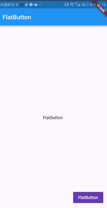
import 'package:flutter/material.dart';

void main() => runApp(MaterialApp(
      home: Scaffold(
        appBar: AppBar(
          title: Text('FlatButton'),
        ),
        body: Center(
          child: Text('FlatButton'),
        ),
        floatingActionButton: FlatButton(
          onPressed: () {},
          child: Text(
            'FlatButton',
            style: TextStyle(color: Colors.white),
          ),
          color: Colors.deepPurple,
        ),
      ),
    ));
IconButton
简介
一个 Material 图标按钮,点击时会有水波动画。
属性介绍
| 属性名 | 类型 | 说明 |
|---|---|---|
| alignment | AlignmentGeometry | 定义图标在 IconButton 中的定位方式 |
| color | Color | 如果启用了图标,则用于按钮内图标的 Color 。默认情况下将其留给图标小部件 |
| disableColor | Color | 如果图标被禁用,则用于按钮内图标的 Color 。默认为当前主题的 ThemeData.disabledColor 。 |
| highlightColor | Color | 按钮处于向下(按下)状态时按钮的辅助 Color 。 高亮 Color 表示为覆盖在按钮 Color (如果有)上的纯色。 如果突出显示 Color 具有透明度,则将显示按钮 Color 。 按住按钮时,突出显示会快速消失。 |
| icon | Widget | 要在按钮内显示的图标 |
| iconSize | double | 按钮内图标的大小。 |
| onPressed | VoidCallback | 按钮的回调 |
| padding | EdgeInsetsGeometry | 按钮图标周围的填充。整个填充图标将对输入手势做出反应 |
| splashColor | Color | 按钮处于向下(按下)状态时按钮的主要 Color 。 飞溅表示为突出显示在 highlightColor 叠加层上方的圆形叠加层。 初始叠加层的中心点与用户触摸事件的生命点相匹配。 如果触摸持续足够长的时间,飞溅叠加将扩展以填充按钮区域。 如果初始 Color 具有透明度,则突出显示和按钮 Color 将显示 |
| tooltip | String | 描述按下按钮时将发生的操作的文本 |
简单示例
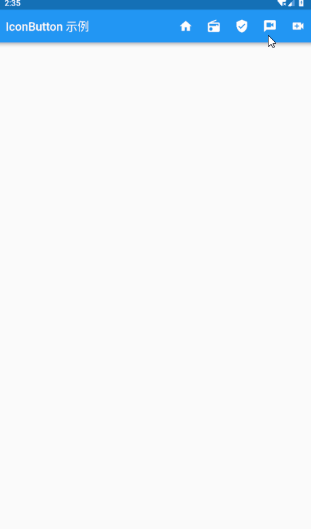
import 'package:flutter/material.dart';

void main()=>runApp(HomePage());

class HomePage extends StatelessWidget {
  @override
  Widget build(BuildContext context) {
    return MaterialApp(
      debugShowCheckedModeBanner: false,
      home: Scaffold(
        appBar: AppBar(
          title: Text('IconButton 示例'),
          actions: <Widget>[
            IconButton(icon: Icon(Icons.home), onPressed: (){}),
            IconButton(icon: Icon(Icons.radio), onPressed: (){}),
            IconButton(icon: Icon(Icons.verified_user), onPressed: (){}),
            IconButton(icon: Icon(Icons.voice_chat), onPressed: (){}),
            IconButton(icon: Icon(Icons.video_call), onPressed: (){}),
          ],
        ),
      ),
    );
  }
}
PopupMenuButton
简介
当菜单隐藏式,点击或调用 onSelected 时显示一个弹出式菜单列表
常用属性
| 属性名 | 类型 | 说明 |
|---|---|---|
| child | Widget | 如果提供,则用于此按钮的小部件。 |
| elevation | double | 打开时放置菜单的z坐标。这可以控制菜单下方阴影的大小 |
| icon | Icon | 如果提供,则用于此按钮的图标 |
| initialValue | T | 菜单项的值(如果有),在菜单打开时应突出显示。 |
| offset | Offset | 应用于弹出菜单按钮的偏移量 |
| onCanceled | PopupMenuCanceled | 当用户在不选择项目的情况下关闭弹出菜单时调用 |
| onSelected | PopupMenuItemSelected | 当用户从此按钮创建的弹出菜单中选择一个值时调用 |
| padding | EdgeInsetsGeometry | 默认情况下,匹配 IconButton 的 8 dps填充。在某些情况下,特别是在此按钮作为列表项的尾随元素出现的情况下,能够将填充设置为零是有用的。 |
| tooltip | String | 描述按下按钮时将发生的操作的文本 |
| itemBuilder | PopupMenuItemBuilder | 按下按钮时调用以创建要在菜单中显示的项目。 |
简单示例
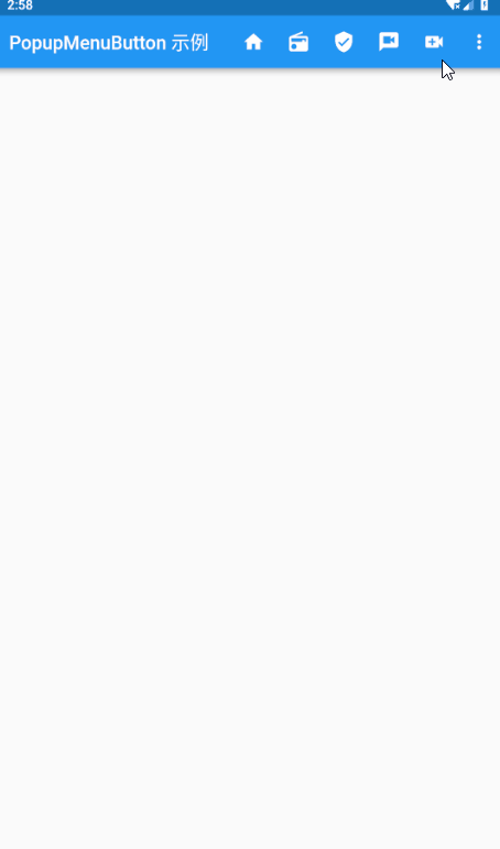
import 'package:flutter/material.dart';

void main() => runApp(HomePage());

class HomePage extends StatelessWidget {
  @override
  Widget build(BuildContext context) {
    return MaterialApp(
      debugShowCheckedModeBanner: false,
      home: Scaffold(
        appBar: AppBar(
          title: Text('PopupMenuButton 示例'),
          actions: <Widget>[
            IconButton(icon: Icon(Icons.home), onPressed: () {}),
            IconButton(icon: Icon(Icons.radio), onPressed: () {}),
            IconButton(icon: Icon(Icons.verified_user), onPressed: () {}),
            IconButton(icon: Icon(Icons.voice_chat), onPressed: () {}),
            IconButton(icon: Icon(Icons.video_call), onPressed: () {}),
            PopupMenuButton(
                itemBuilder: (context) => [
                      PopupMenuItem(child: Text('popupMenuItem ')),
                      PopupMenuItem(child: Text('popupMenuItem 1')),
                      PopupMenuItem(child: Text('popupMenuItem 2')),
                      PopupMenuItem(child: Text('popupMenuItem 3')),
                    ]
              ,
              onCanceled: (){
                  print('onCenten');
              },
            ),
          ],
        ),
      ),
    );
  }
}
ButtonBar
简介
水平排列的按钮组
常用属性
| 属性名 | 类型 | 说明 |
|---|---|---|
| alignment | MainAxisAlignment | 如何将孩子放在水平轴上 |
| children | List | 按钮水平排列 |
| mainAxisSize | MainAxisSize | 有多少水平空间可供选择。请参见Row.mainAxisSize |
简单示例
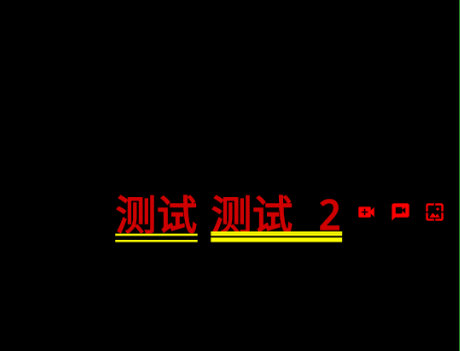
ButtonBar(
        children: <Widget>[
          Text('测试'),
          Text('测试 2'),
          Icon(Icons.video_call,color: Color(0xffff0000),),
          Icon(Icons.voice_chat,color: Color(0xffff0000),),
          Icon(Icons.wallpaper,color: Color(0xffff0000),),
        ],
      ),
输入框和选择框
TextField
简介
一个文本输入框
常用属性
| 属性名 | 类型 | 说明 |
|---|---|---|
| aotocorrect | bool | 是否启用自动更正 |
| autofocus | bool | 如果没有其他内容已经集中,这个文本字段是否应该集中注意力 |
| buildCounter | InputCounterWidgetBuilder | 生成自定义InputDecorator.counter 小部件的回调 |
| controller | TextEditingController | 绘制光标时使用的 Color 。 |
| cursorColor | Color | 绘制光标时使用的 Color |
| cursorRadius | Radius | 光标的角应该是多圆的 |
| cursorWidth | double | 光标的厚度。 |
| decoration | InputDecoration | 在文本字段周围显示的装饰。 |
| dragStartBehavior | DragStartBehavior | 确定处理拖动开始行为的方式。 |
| enable | bool | 如果为 false,则文本字段为“禁用”:它忽略点击并且其装饰以灰 Color 呈现。 |
| enableInteractiveSelection | bool | 如果为 true,则长按此TextField 将选择文本并显示剪切/复制/粘贴菜单,并且点击将移动文本插入符号。 |
| focusNode | FocusNode | 定义此窗口小部件的键盘焦点 |
| inputFormatters | List | 可选的输入验证和格式覆盖。 |
| keyboardAppearance | Brightness | 键盘的外观 |
| keyboardType | TextInputType | 用于编辑文本的键盘类型 |
| maxLength | int | 如果为 true,则阻止该字段允许超过 maxLength 个字符 |
| maxLines | int | 文本要跨越的最大行数,必要时包装 |
| obsureText | bool | 是否隐藏正在编辑的文本(例如,用于密码)。 |
| onCanged | ValueChanged | 当用户启动对 TextField 值的更改时调用:当他们插入或删除文本时。 |
| onEditingComplete | VoidCallback | 当用户提交可编辑内容时调用(例如,用户按下键盘上的“完成”按钮)。 |
| onSubmitted | ValueChanged | 当用户指示他们已完成编辑字段中的文本时调用 |
| onTap | GestureTapCallback | 当用户点击此文本字段时调用 |
| scrollPadding | EdgeInsets | 当 Textfield 滚动到视图中时,将填充配置到Scrollable 周围的边缘。 |
| selectionEnabled | bool | 如果基于enableInteractiveSelection和obscureText 的值启用了交互式选择,则为 True。 |
| style | TextStyle | 用于正在编辑的文本的样式。 |
| textAlign | TextAlign | 文本应如何水平对齐 |
| textCapitalization | TextCapitalization | 配置平台键盘如何选择大写或小写键盘。 |
| textDirection | TextDirection | 文本的方向性 |
| textInputAction | TextInputAction | 用于键盘的操作按钮类型 |
简单示例
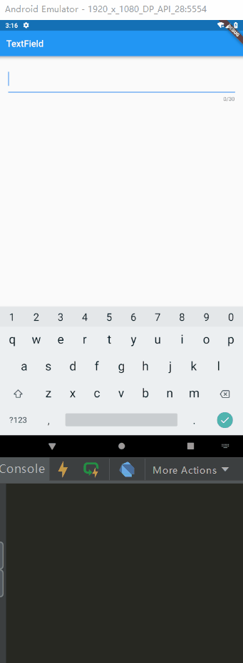
import 'package:flutter/material.dart';

void main() => runApp(MaterialApp(
      home: TextFieldPage(),
    ));

class TextFieldPage extends StatelessWidget {
  Widget buildTextField(TextEditingController controller) {
    return TextField(
      controller: controller,
      maxLength: 30,
      //最大长度,设置此项会让TextField右下角有一个输入数量的统计字符串
      maxLines: 1,
      //最大行数
      autocorrect: true,
      //是否自动更正
      autofocus: true,
      //是否自动对焦
      obscureText: true,
      //是否是密码
      textAlign: TextAlign.start,
      //文本对齐方式
      style: TextStyle(fontSize: 30.0, color: Colors.blue),
      //输入文本的样式
//      inputFormatters: [WhitelistingTextInputFormatter.digitsOnly,BlacklistingTextInputFormatter.singleLineFormatter],
      //允许的输入格式
      onChanged: (text) {
        //内容改变的回调
        print('change $text');
      },
      onSubmitted: (text) {
        //内容提交(按回车)的回调
        print('submit $text');
      },
      enabled: true, //是否禁用
    );
  }

  @override
  Widget build(BuildContext context) {
    final controller = TextEditingController();
    controller.addListener(() {
      print('input ${controller.text}');
    });
    return Scaffold(
      appBar: AppBar(
        title: Text('TextField'),
      ),
      body: Padding(
        padding: const EdgeInsets.all(20.0),
        child: buildTextField(controller),
      ),
    );
  }
}
Checkbox
简介
复选框,允许用户从一组中选择多个选项。
常用属性
| 属性名 | 类型 | 说明 |
|---|---|---|
| activeColor | Color | 选中此复选框时要使用的 Color |
| checkColor | Color | 选中此复选框时用于检查图标的 Color |
| tristate | bool | 如果为true,则复选框的值可以为true,false或null。 |
| materialTapTargetSize | MaterialTapTargetSize | 配置点击目标的最小尺寸 |
| onChanged | ValueChanged | 当复选框的值应该更改时调用 |
| values | bool | 是否选中此复选框 |
简单示例
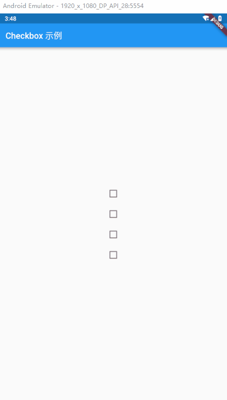
import 'package:flutter/material.dart';

void main() => runApp(MaterialApp(home: CheckboxPage()));

class CheckboxPage extends StatefulWidget {
  @override
  _CheckboxPageState createState() => _CheckboxPageState();
}

class _CheckboxPageState extends State<CheckboxPage> {

  bool _values = false;

  @override
  Widget build(BuildContext context) {
    return Scaffold(
      appBar: AppBar(
        title: Text('Checkbox 示例'),
      ),
      body: Center(
        child: Column(
          children: <Widget>[
            Checkbox(
              //选中的背景色
              activeColor: Colors.red,
              //选中的 勾 的颜色
              checkColor: Colors.white,
                materialTapTargetSize: MaterialTapTargetSize.padded,
                value: _values,
                onChanged: (isSelect) {
                setState(() {
                  _values = isSelect;
                });
                  print(isSelect);
                })
          ],
        ),
      )
    );
  }
}
Radio
简介
单选框,允许用户从一组中选择一个选项。
常用属性
| 属性名 | 类型 | 说明 |
|---|---|---|
| activeColor | Color | 选中的背景色 |
| groupValue | T | 此组单选按钮的当前选定值 |
| materialTapTargetSize | MaterialTapTargetSize | 配置点击目标的最小尺寸。 |
| onCanged | ValueChanged | 当用户选择此单选按钮时调用 |
| value | T | 此单选按钮表示的值 |
简单示例
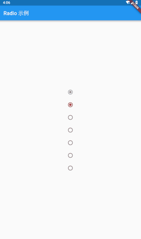
import 'package:flutter/material.dart';

void main() => runApp(MaterialApp(home: CheckboxPage()));

class CheckboxPage extends StatefulWidget {
  @override
  _CheckboxPageState createState() => _CheckboxPageState();
}

class _CheckboxPageState extends State<CheckboxPage> {

  var groupValue = 1;
  updateGroupValue(t){
    setState(() {
      groupValue = t;
    });
  }

  @override
  Widget build(BuildContext context) {
    return Scaffold(
        appBar: AppBar(
          title: Text('Checkbox 示例'),
        ),
        body: Center(
          child: Column(
            mainAxisAlignment: MainAxisAlignment.center,
            children: <Widget>[
              new Radio(value: 0, groupValue: 0, onChanged: null),//onChanged为null表示按钮不可用
              new Radio(
                  value: 1,
                  groupValue: groupValue,//当value和groupValue一致的时候则选中
                  activeColor: Colors.red,
                  onChanged: (T){
                    updateGroupValue(T);
                  }
              ),
              new Radio(
                  value: 2,
                  groupValue: groupValue,
                  onChanged: (T){
                    updateGroupValue(T);
                  }
              ),
              new Radio(
                  value: 3,
                  groupValue: groupValue,
                  onChanged: (T){
                    updateGroupValue(T);
                  }
              ),
              new Radio(
                  value: 4,
                  groupValue: groupValue,
                  onChanged: (T){
                    updateGroupValue(T);
                  }
              ),
              new Radio(
                  value: 5,
                  groupValue: groupValue,
                  onChanged: (T){
                    updateGroupValue(T);
                  }
              ),
              new Radio(
                  value: 6,
                  groupValue: groupValue,
                  onChanged: (T){
                    updateGroupValue(T);
                  }
              ),

            ],
          ),
        )
    );
  }
}
Switch
简介
On / off 用于切换一个单一状态
常用属性
| 属性名 | 类型 | 说明 |
|---|---|---|
| activeColor | Color | 这个颜色代表选择时的背景色 |
| groupValue | T | 此组单选按钮的当前选定值 |
| materialTapTargetSize | MaterialTapTargetSize | 配置点击目标的最小尺寸 |
| onChanged | ValueChanged | 当用户选择此单选按钮时调用 |
| value | T | 此单选按钮表示的值 |
简单示例
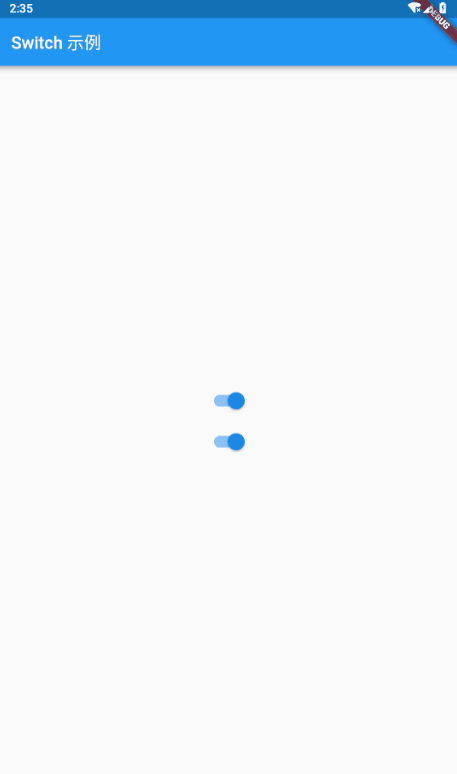
import 'package:flutter/material.dart';

void main() => runApp(MaterialApp(home: SwitchPage()));

class SwitchPage extends StatefulWidget {
  @override
  _SwitchPageState createState() => _SwitchPageState();
}

class _SwitchPageState extends State<SwitchPage> {
  var groupValue = 1;
  var _value = true;

  updateGroupValue(t) {
    setState(() {
      groupValue = t;
    });
  }

  @override
  Widget build(BuildContext context) {
    return Scaffold(
        appBar: AppBar(
          title: Text('Switch 示例'),
        ),
        body: Center(
          child: Column(
            mainAxisAlignment: MainAxisAlignment.center,
            children: <Widget>[
              Switch(
                  activeColor: Colors.deepPurple,
                  value: _value,
                  onChanged: (select) {
                    setState(() {
                      _value = select;
                    });
                  }),
              Switch(
                  value: _value,
                  onChanged: (select) {
                    setState(() {
                      _value = select;
                    });
                  }),
            ],
          ),
        ));
  }
}
Slider
简介
滑块,允许用户通过滑动滑块来从一系列值中选择。
常用属性
| 属性名 | 类型 | 说明 |
|---|---|---|
| activeColor | Color | 用于滑块轨道中活动部分的颜色 |
| divisions | int | 离散分数的数量 |
| inactiveColor | Color | 滑动轨道未滑动的颜色值 |
| label | String | 滑块处于活动状态时显示在滑块上方的标签 |
| max | double | 用户可以选择的最大值 |
| min | double | 用于可以选择的最小值 |
| onChanged | ValueChanged | 滑动监听的值 |
| onChangeEnd | ValueChanged | 滑动结束 |
| onChangeStart | ValueChanged | 滑动开始 |
| semanticFormatterCallback | SemanticFormatterCallback | 回调用于从滑块值创建语义值 |
| value | double | 此滑块的当前选定值 |
简单示例
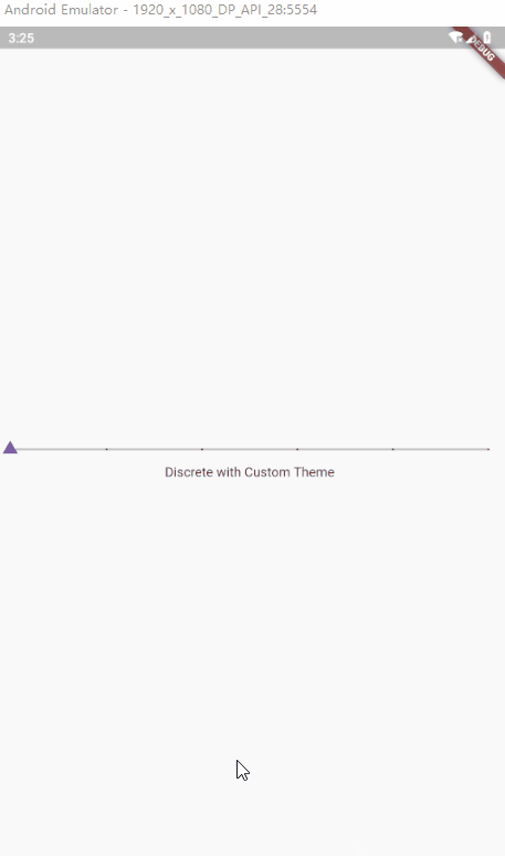
import 'package:flutter/material.dart';
import 'dart:math' as math;
void main()=> runApp(MaterialApp(home: SliderPage()));
class SliderPage extends StatefulWidget {
  @override
  _SliderPageState createState() => _SliderPageState();
}
Path _triangle(double size, Offset thumbCenter, {bool invert = false}) {
  final Path thumbPath = Path();
  final double height = math.sqrt(3.0) / 2.0;
  final double halfSide = size / 2.0;
  final double centerHeight = size * height / 3.0;
  final double sign = invert ? -1.0 : 1.0;
  thumbPath.moveTo(thumbCenter.dx - halfSide, thumbCenter.dy + sign * centerHeight);
  thumbPath.lineTo(thumbCenter.dx, thumbCenter.dy - 2.0 * sign * centerHeight);
  thumbPath.lineTo(thumbCenter.dx + halfSide, thumbCenter.dy + sign * centerHeight);
  thumbPath.close();
  return thumbPath;
}
class _SliderPageState extends State<SliderPage> {
  double _value = 25.0;
  double _discreteValue = 20.0;

  _upDataValue(double){
    setState(() {
      _value = double;
    });
  }

  @override
  Widget build(BuildContext context) {
    final ThemeData theme = Theme.of(context);
    return Scaffold(
      body: Column(
        mainAxisAlignment: MainAxisAlignment.center,
        children: <Widget>[
          SliderTheme(
            data: theme.sliderTheme.copyWith(
              activeTrackColor: Colors.deepPurple,
              inactiveTrackColor: Colors.black26,
              activeTickMarkColor: Colors.white70,
              inactiveTickMarkColor: Colors.black,
              overlayColor: Colors.black12,
              thumbColor: Colors.deepPurple,
              valueIndicatorColor: Colors.deepPurpleAccent,
              thumbShape: _CustomThumbShape(),
              valueIndicatorShape: _CustomValueIndicatorShape(),
              valueIndicatorTextStyle: theme.accentTextTheme.body2.copyWith(color: Colors.black87),
            ),
            child: Slider(
              value: _discreteValue,
              min: 0.0,
              max: 200.0,
              divisions: 5,
              semanticFormatterCallback: (double value) => value.round().toString(),
              label: '${_discreteValue.round()}',
              onChanged: (double value) {
                setState(() {
                  _discreteValue = value;
                });
              },
            ),
          ),
          const Text('Discrete with Custom Theme'),
        ],
      ),
    );
  }
}
class _CustomThumbShape extends SliderComponentShape {
  static const double _thumbSize = 4.0;
  static const double _disabledThumbSize = 3.0;

  @override
  Size getPreferredSize(bool isEnabled, bool isDiscrete) {
    return isEnabled ? const Size.fromRadius(_thumbSize) : const Size.fromRadius(_disabledThumbSize);
  }

  static final Animatable<double> sizeTween = Tween<double>(
    begin: _disabledThumbSize,
    end: _thumbSize,
  );

  @override
  void paint(
      PaintingContext context,
      Offset thumbCenter, {
        Animation<double> activationAnimation,
        Animation<double> enableAnimation,
        bool isDiscrete,
        TextPainter labelPainter,
        RenderBox parentBox,
        SliderThemeData sliderTheme,
        TextDirection textDirection,
        double value,
      }) {
    final Canvas canvas = context.canvas;
    final ColorTween colorTween = ColorTween(
      begin: sliderTheme.disabledThumbColor,
      end: sliderTheme.thumbColor,
    );
    final double size = _thumbSize * sizeTween.evaluate(enableAnimation);
    final Path thumbPath = _triangle(size, thumbCenter);
    canvas.drawPath(thumbPath, Paint()..color = colorTween.evaluate(enableAnimation));
  }
}

class _CustomValueIndicatorShape extends SliderComponentShape {
  static const double _indicatorSize = 4.0;
  static const double _disabledIndicatorSize = 3.0;
  static const double _slideUpHeight = 40.0;

  @override
  Size getPreferredSize(bool isEnabled, bool isDiscrete) {
    return Size.fromRadius(isEnabled ? _indicatorSize : _disabledIndicatorSize);
  }

  static final Animatable<double> sizeTween = Tween<double>(
    begin: _disabledIndicatorSize,
    end: _indicatorSize,
  );

  @override
  void paint(
      PaintingContext context,
      Offset thumbCenter, {
        Animation<double> activationAnimation,
        Animation<double> enableAnimation,
        bool isDiscrete,
        TextPainter labelPainter,
        RenderBox parentBox,
        SliderThemeData sliderTheme,
        TextDirection textDirection,
        double value,
      }) {
    final Canvas canvas = context.canvas;
    final ColorTween enableColor = ColorTween(
      begin: sliderTheme.disabledThumbColor,
      end: sliderTheme.valueIndicatorColor,
    );
    final Tween<double> slideUpTween = Tween<double>(
      begin: 0.0,
      end: _slideUpHeight,
    );
    final double size = _indicatorSize * sizeTween.evaluate(enableAnimation);
    final Offset slideUpOffset = Offset(0.0, -slideUpTween.evaluate(activationAnimation));
    final Path thumbPath = _triangle(
      size,
      thumbCenter + slideUpOffset,
      invert: true,
    );
    final Color paintColor = enableColor.evaluate(enableAnimation).withAlpha((255.0 * activationAnimation.value).round());
    canvas.drawPath(
      thumbPath,
      Paint()..color = paintColor,
    );
    canvas.drawLine(
        thumbCenter,
        thumbCenter + slideUpOffset,
        Paint()
          ..color = paintColor
          ..style = PaintingStyle.stroke
          ..strokeWidth = 2.0);
    labelPainter.paint(canvas, thumbCenter + slideUpOffset + Offset(-labelPainter.width / 2.0, -labelPainter.height - 4.0));
  }
}
Date & Time Pickers
简介
日期&时间选择
简单示例
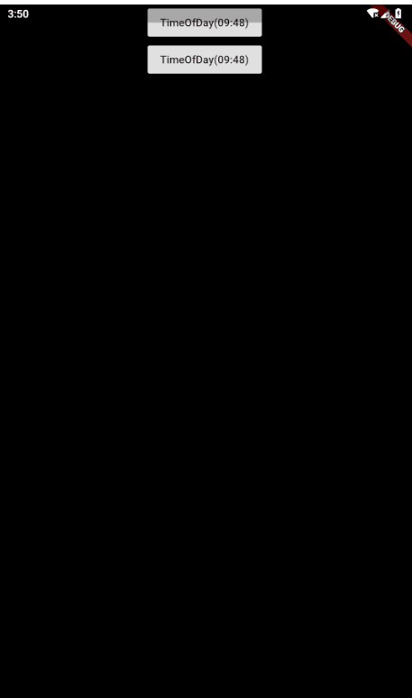
import 'package:flutter/material.dart';

void main() => runApp(MaterialApp(
  color: Colors.white,
      home: DatePickerDemo(),
    ));

class DatePickerDemo extends StatefulWidget {
  @override
  State<StatefulWidget> createState() => _DatePickerDemo();
}

class _DatePickerDemo extends State<DatePickerDemo> {
  _showDataPicker() async {
    Locale myLocale = Localizations.localeOf(context);
    var picker = await showDatePicker(
        context: context,
        initialDate: DateTime.now(),
        firstDate: DateTime(2016),
        lastDate: DateTime(2020),
        locale: myLocale);
    setState(() {
      _time = picker.toString();
    });
  }

  _showTimePicker() async {
    var picker =
        await showTimePicker(context: context, initialTime: TimeOfDay.now());
    setState(() {
      _time = picker.toString();
    });
  }

  var _time;

  @override
  Widget build(BuildContext context) {
    // TODO: implement build
    return Column(
      children: <Widget>[
        RaisedButton(
          child: Text(_time == null ? '选择日期' : _time),
          onPressed: () => _showDataPicker(),
        ),
        RaisedButton(
          child: Text(_time == null ? '选择时间' : _time),
          onPressed: () => _showTimePicker(),
        ),
      ],
    );
  }
}
对话框、Alert 、Panel
SimpleDialog
简介
简单对话框可以显示附加的提示或操作
常用属性
| 属性名 | 类型 | 说明 |
|---|---|---|
| backgroundColor | Color | 此对话框表面的背景颜色 |
| children | List | 对话框的(可选)内容显示在标题下方的SingleChildScrollView 中 |
| contentPadding | EdgeInsetsGeometry | 填充内容。 |
| elevation | double | 对话框的坐标 |
| semanticLable | String | 可访问性框架用于在打开和关闭对话框时通知屏幕转换的对话框的语义标签 |
| shape | ShapeBorder | 此对话框边框的形状 |
| title | Widget | 对话框的(可选)标题在对话框顶部以大字体显示 |
| titlePadding | EdgeInsetsGeometry | 在标题周围填充。 |
简单示例
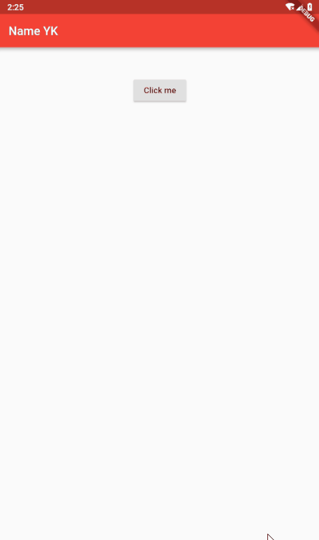
import 'package:flutter/material.dart';
import 'dart:async';

void main(){
  runApp(new MaterialApp(
    home: new MyApp(),
  ));
}

class MyApp extends StatefulWidget {
  @override
  _State createState() => new _State();
}

enum Answers{YES,NO,MAYBE}

class _State extends State<MyApp>{

  String _value = '';

  void _setValue(String value) => setState(() => _value = value);

  Future _askUser() async {
    switch(
    await showDialog(
        context: context,
        child: new SimpleDialog(
          title: new Text('测试 SimpleDialog'),
          semanticLabel: '---',
          children: <Widget>[
            new SimpleDialogOption(child: new Text('Yes!!!'),onPressed: (){Navigator.pop(context, Answers.YES);},),
            new SimpleDialogOption(child: new Text('NO :('),onPressed: (){Navigator.pop(context, Answers.NO);},),
            new SimpleDialogOption(child: new Text('Maybe :|'),onPressed: (){Navigator.pop(context, Answers.MAYBE);},),
          ],
        )
    )
    ) {
      case Answers.YES:
        _setValue('Yes');
        break;
      case Answers.NO:
        _setValue('No');
        break;
      case Answers.MAYBE:
        _setValue('Maybe');
        break;
    }
  }

  @override
  Widget build(BuildContext context) {
    return new Scaffold(
      appBar: new AppBar(
        title: new Text('Name YK'),
        backgroundColor: Colors.red,
      ),
      body: new Container(
        padding: new EdgeInsets.all(32.0),
        child: new Center(
          child: new Column(
            children: <Widget>[
              new Text(_value),
              new RaisedButton(onPressed: _askUser, child: new Text('Click me'),)
            ],
          ),
        ),
      ),
    );
  }
}
AlertDialog
简介
一个会中断用户操作的对话款,需要用户确认
常用属性
| 属性名 | 类型 | 说明 |
|---|---|---|
| actions | List | 显示在对话框底部的(可选)操作集 |
| backgroundColor | Color | 此对话框表面的背景颜色 |
| content | Widget | 对话框的(可选)内容以较浅的字体显示在对话框的中央 |
| contentPadding | EdgeInsetsGeometry | 填充内容 |
| contentTextStyle | TextStyle | 此 AlertDialog 内容中文本的样式 |
| elevation | double | 此对话框的z坐标 |
| semanticLable | String | 可访问性框架用于在打开和关闭对话框时通知屏幕转换的对话框的语义标签。 |
| title | Widget | 对话框的(可选)标题在对话框顶部以大字体显示。 |
| titlePadding | EdgeInsetsGeometry | 在标题周围填充 |
| titleTextStyle | TextStyle | 此 AlertDialog 标题中文本的样式 |
| shape | ShapeBorder | 此对话框边框的形状。 |
简单示例
import 'package:flutter/material.dart';
import 'dart:async';
void main(){
runApp(new MaterialApp(
home: new MyApp(),
));
}
class MyApp extends StatefulWidget {
@override
_State createState() => new _State();
}
//State is information of the application that can change over time or when some actions are taken.
class _State extends State<MyApp>{
Future _showAlert(BuildContext context, String message) async {
return showDialog(
context: context,
child: new AlertDialog(
title: new Text(message),
content: Text(message,style: TextStyle(fontSize: 14.0),),
actions: <Widget>[
new FlatButton(onPressed: () => Navigator.pop(context), child: new Text('no')),
new FlatButton(onPressed: () => Navigator.pop(context), child: new Text('Ok'))
],
)
);
}
@override
Widget build(BuildContext context) {
return new Scaffold(
appBar: new AppBar(
title: new Text('Name here'),
backgroundColor: Colors.red,
),
//hit Ctrl+space in intellij to know what are the options you can use in flutter widgets
body: new Container(
padding: new EdgeInsets.all(32.0),
child: new Center(
child: new Column(
children: <Widget>[
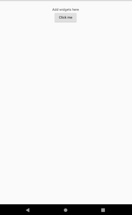
new Text('Add widgets here'),
new RaisedButton(onPressed: () => _showAlert(context, 'Do you like flutter, I do!'), child: new Text('Click me'),)
],
),
),
),
);
}
}
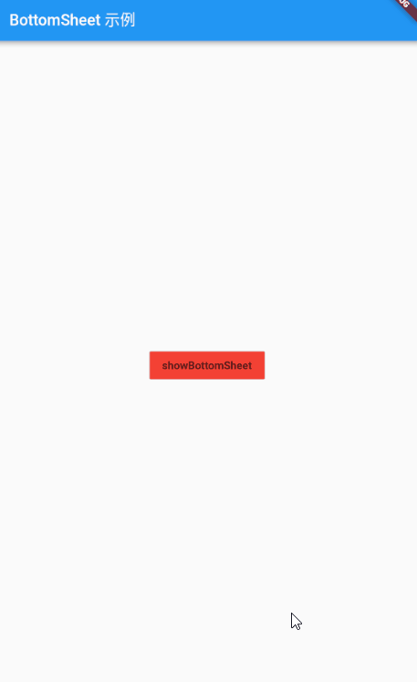
BottomSheet
简介
BottomSheet 是一个从屏幕底部滑起的列表(以显示更多的内容)。你可以调用showBottomSheet() 或 showModalBottomSheet 弹出
常用属性
| 属性名 | 类型 | 说明 |
|---|---|---|
| animationController | AnimationController | 控制底部工作表位置的动画 |
| builder | WidgetBuilder | 工作表内容的构建器。 |
| elevation | double | 将此材质相对于其父级放置的z坐标。 |
| onClosing | VoidCallback | 当底部纸张开始关闭时调用 |
| enableDrag | bool | 如果为 true,则可以通过向下滑动来向上和向下拖动底部纸张 |
简单示例
import 'package:flutter/material.dart';

void main() => runApp(MaterialApp(home: BottomSheetPage()));

class BottomSheetPage extends StatefulWidget {
  @override
  _BottomSheetPageState createState() => _BottomSheetPageState();
}

class _BottomSheetPageState extends State<BottomSheetPage> {
  @override
  Widget build(BuildContext context) {
    return Scaffold(
      appBar: AppBar(
        title: Text('BottomSheet 示例'),
      ),
      body: Container(
        child: Center(
            child: FlatButton(
              color: Colors.red,
                onPressed: () => showBottom(context), child: Text('showBottomSheet'))),
      ),
    );
  }
}

Future<Widget> showBottom(BuildContext buildContext) async {
 return await showModalBottomSheet(
     context: buildContext, builder: (context){
   return ListView.builder(
       itemCount: 100,
       itemBuilder: (context,index){
     return ListTile(
       onTap: (){
         print("index:$index");
         Navigator.pop(context);
       },
       leading:Icon(Icons.ac_unit),title:Text('Dev_Yk:$index'),
     );
   });
 });

}
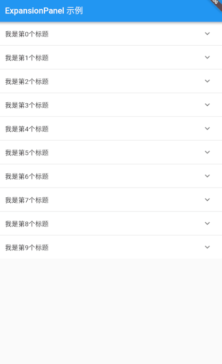
ExpansionPanel
简介
扩展面板包含创建流程,允许轻量编辑元素。 ExpansionPanel 小部件实现此组件。
常用属性
| 属性名 | 类型 | 说明 |
|---|---|---|
| body | Widget | 扩展面板的主体显示在标题下方。 |
| headerBuilder | ExpansionPanelHeaderBuilder | 构建扩展面板标题的小组件构建器。 |
| isExpander | bool | 面板是否扩展。 |
简单示例
import 'package:flutter/material.dart';

void main() {
  runApp(new MaterialApp(
    home: ExpansionPanelListDemo(),
  ));
}

class ExpansionPanelListDemo extends StatefulWidget {
  @override
  _ExpansionPanelListDemoState createState() => _ExpansionPanelListDemoState();
}

class ExpandStateBean{
  var isOpen;
  var index;
  ExpandStateBean(this.index,this.isOpen);
}

class _ExpansionPanelListDemoState extends State<ExpansionPanelListDemo> {
  var currentPanelIndex = -1;
  List<int> mList;
  List<ExpandStateBean> expandStateList;
  _ExpansionPanelListDemoState() {
    mList = new List();
    expandStateList=new List();
    for (int i = 0; i < 10; i++) {
      mList.add(i);
      expandStateList.add(ExpandStateBean(i, false));
    }
  }


  _setCurrentIndex(int index,isExpand) {
    setState(() {
      expandStateList.forEach((item){
        if (item.index==index) {
          item.isOpen=!isExpand;
        }
      });

    });
  }

  @override
  Widget build(BuildContext context) {
    return Scaffold(
        appBar: AppBar(
          title: Text("ExpansionPanel 示例"),
        ),
        body: SingleChildScrollView(child: ExpansionPanelList(
          children: mList.map((index) {
            return new ExpansionPanel(
              headerBuilder: (context, isExpanded) {
                return new ListTile(
                  title: new Text('我是第$index个标题'),
                );
              },
              body: new Padding(
                padding: EdgeInsets.symmetric(horizontal: 5.0),
                child: Container(height: 100.0,
                  color: Colors.blue,
                  alignment: Alignment.center,
                  child:Icon(Icons.security,size: 35.0,),),
              ),
              isExpanded: expandStateList[index].isOpen,
            );
          }).toList(),

          expansionCallback: (index, bol) {
            _setCurrentIndex(index,bol);
          },

        ),));
  }
}
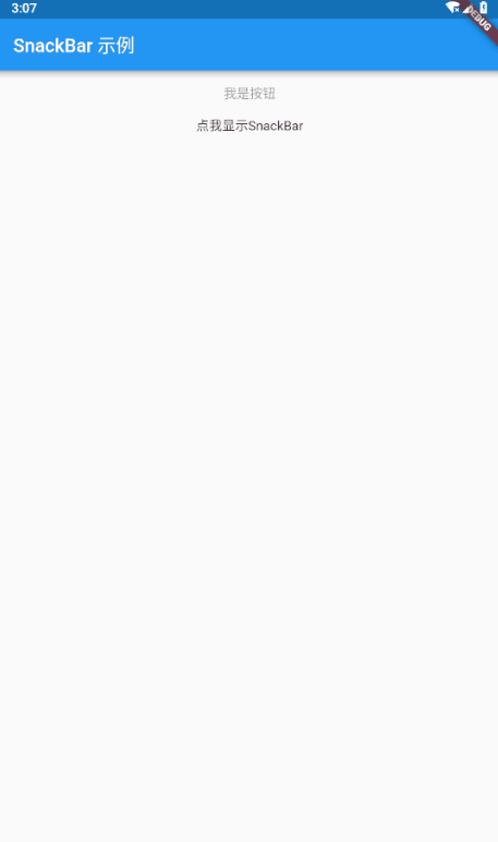
SnackBar
简介
具有可选操作的轻量级消息提示,在屏幕的底部显示。
常用属性
| 属性名 | 类型 | 说明 |
|---|---|---|
| action | SnackBarAction | (可选)用户可以根据小吃店执行的操作。 |
| animatiion | Animation | 入口和出口的动画 |
| backgroundColor | Color | Snackbar 的背景颜色。默认情况下,颜色为深灰色 |
| content | Widget | 主要内容 |
| duration | Duration | 应该显示时间长度 |
简单示例
import 'package:flutter/material.dart';

void main() => runApp(
      MaterialApp(
        home: SnackBarPage(),
      ),
    );

class SnackBarPage extends StatefulWidget {
  @override
  _SnackBarPageState createState() => _SnackBarPageState();
}

class _SnackBarPageState extends State<SnackBarPage> {
  @override
  Widget build(BuildContext context) {
    return Scaffold(
      appBar: AppBar(
        title: Text('SnackBar 示例'),
      ),
      body: Center(
        child: new ListView(
          children: <Widget>[
            new FlatButton(
              onPressed: null,
              child: new Text('我是按钮'),
            ),
            new Builder(builder: (BuildContext context) {
              return new Center(
                child: new GestureDetector(
                  onTap: () {
                    final mySnackBar = SnackBar(
                      content: new Text('我是SnackBar'),
                      backgroundColor: Colors.red,
                      duration: Duration(seconds: 1),
                      action: new SnackBarAction(label: '我是scackbar按钮', onPressed: () {
                        print('点击了snackbar按钮');
                      }),
                    );
                    Scaffold.of(context).showSnackBar(mySnackBar);
                  },
                  child: new Text('点我显示SnackBar'),
                ),
              );
            }),
          ],
        ),
      ),
    );
  }
}
信息展示
Image
请参考目录 基础Widget/图像 Image
Icon
请参考目录 基础Widget/图标 Icon
Chip
简介
标签,一个 Material widget 。 它可以将一个复杂内容实体展现在一个小块中,如联系人。
常用属性
| 属性名 | 类型 | 说明 |
|---|---|---|
| avatar | Widget | 在芯片标签之前显示的小部件。 |
| backgroudColor | Color | 用于未选定的启用芯片背景的颜色 |
| clipBehavior | Clip | 根据此选项,内容将被剪裁(或不剪辑) |
| deleteButtonTooltipMessage | String | 用于芯片删除按钮工具提示的消息。 |
| deleteIcon | Widget | 设置 onDeleted 时显示的图标。 |
| deleteIconColor | Color | 删除图标的颜色。默认值基于环境 IconTheme.color |
| elevation | double | 相对于其父级在芯片上应用的高程。 |
| label | Widget | 芯片的主要内容 |
| labelStyle | TextStyle | 要应用于芯片标签的样式 |
| materialTapTargetSize | MaterialTapTargetSize | 配置点击目标的最小尺寸 |
| onDeleted | VoidCallback | 当用户点击 deleteIcon 删除芯片时调用 |
| padding | EdgeInsetsGeometry | 芯片内容与外形之间的填充 |
| shape | ShapeBorder | ShapeBorder 在芯片周围绘制 |
简单示例
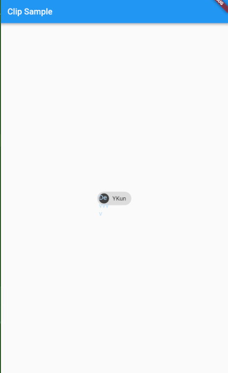
import 'package:flutter/material.dart';

void main() =>runApp (MaterialApp(home: ClipSample()));

class ClipSample extends StatefulWidget {
  @override
  _ClipSampleState createState() => _ClipSampleState();
}

class _ClipSampleState extends State<ClipSample> {
  @override
  Widget build(BuildContext context) {
    return Scaffold(
      appBar: AppBar(
        title: Text("Clip Sample"),
      ),
      body: Center(
        child: Chip(
          avatar: CircleAvatar(
            backgroundColor: Colors.grey.shade800,
            child: Text('Dev'),
          ),
          label: Text('YKun'),
        ),
      ),
    );
  }
}
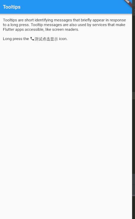
Tooltip
简介
一个文本提示工具,帮助解释一个按钮或其他用户界面,当widget长时间按下时(当用户采取其他适当操作时)显示一个提示标签。
常用属性
| 属性名 | 类型 | 说明 |
|---|---|---|
| child | widget | 树中此小部件下方的小部件 |
| excludeFromSemantics | bool | 是否应从语义树中排除工具提示的消息。 |
| height | double | 工具提示应占用的垂直空间量(在其填充内)。 |
| message | String | 要在工具提示中显示的文本 |
| padding | EdgeInsetsGeometry | 插入孩子的空间量 |
| preferBelow | bool | 工具提示是否默认显示在窗口小部件下方 |
| verticalOffset | double | 窗口小部件与显示的工具提示之间的垂直距离量 |
简单示例
// Copyright 2016 The Chromium Authors. All rights reserved.
// Use of this source code is governed by a BSD-style license that can be
// found in the LICENSE file.

import 'package:flutter/material.dart';

void main()=>runApp(MaterialApp(home: TooltipDemo(),));
const String _introText =
    'Tooltips are short identifying messages that briefly appear in response to '
    'a long press. Tooltip messages are also used by services that make Flutter '
    'apps accessible, like screen readers.';

class TooltipDemo extends StatelessWidget {

  static const String routeName = '/material/tooltips';

  @override
  Widget build(BuildContext context) {
    final ThemeData theme = Theme.of(context);
    return Scaffold(
      appBar: AppBar(
        title: const Text('Tooltips'),
      ),
      body: Builder(
          builder: (BuildContext context) {
            return SafeArea(
              top: false,
              bottom: false,
              child: ListView(
                children: <Widget>[
                  Text(_introText, style: theme.textTheme.subhead),
                  Row(
                    children: <Widget>[
                      Text('Long press the ', style: theme.textTheme.subhead),
                      Tooltip(
                        message: 'call icon',
                        child: Icon(
                          Icons.call,
                          size: 18.0,
                          color: theme.iconTheme.color,
                        ),
                      ),

                      Tooltip(
                        message: '长按我显示了',
                        child: Text('测试点击显示', style: theme.textTheme.subhead),
                      ),
                      Text(' icon.', style: theme.textTheme.subhead),
                    ],
                  ),
         /*         Center(
                    child: IconButton(
                      iconSize: 48.0,
                      icon: const Icon(Icons.call),
                      color: theme.iconTheme.color,
                      tooltip: 'Place a phone call',
                      onPressed: () {
                        Scaffold.of(context).showSnackBar(const SnackBar(
                          content: Text('That was an ordinary tap.'),
                        ));
                      },
                    ),
                  ),*/
                ]
                    .map<Widget>((Widget widget) {
                  return Padding(
                    padding: const EdgeInsets.only(top: 16.0, left: 16.0, right: 16.0),
                    child: widget,
                  );
                })
                    .toList(),
              ),
            );
          }
      ),
    );
  }
}
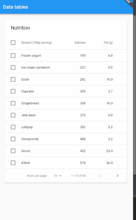
DataTable
简介
数据表显示原始数据集。它们通常出现在桌面企业产品中。DataTable Widget 实现这个组件
常用属性
| 属性名 | 类型 | 说明 |
|---|---|---|
| columns | List | 表中列的配置和标签。 |
| onSelectAll | ValueSetter | 当用户使用标题行中的复选框选择或取消选择每一行时调用. |
| rows | List | 每行显示的数据(不包括列标题的行)。必须为非 null ,但可以为空. |
| sortAscending | bool | sortColumnIndex 中提到的列是否按升序排序。 |
| sortColumnIndex | int | 当前主排序键的列。 |
简单示例
// Copyright 2016 The Chromium Authors. All rights reserved.
// Use of this source code is governed by a BSD-style license that can be
// found in the LICENSE file.

import 'package:flutter/material.dart';
import 'package:flutter/rendering.dart';

void main()=>runApp(MaterialApp(home: DataTableDemo(),));
class Dessert {
  Dessert(this.name, this.calories, this.fat, this.carbs, this.protein, this.sodium, this.calcium, this.iron);
  final String name;
  final int calories;
  final double fat;
  final int carbs;
  final double protein;
  final int sodium;
  final int calcium;
  final int iron;

  bool selected = false;
}

class DessertDataSource extends DataTableSource {
  final List<Dessert> _desserts = <Dessert>[
    Dessert('Frozen yogurt',                        159,  6.0,  24,  4.0,  87, 14,  1),
    Dessert('Ice cream sandwich',                   237,  9.0,  37,  4.3, 129,  8,  1),
    Dessert('Eclair',                               262, 16.0,  24,  6.0, 337,  6,  7),
    Dessert('Cupcake',                              305,  3.7,  67,  4.3, 413,  3,  8),
    Dessert('Gingerbread',                          356, 16.0,  49,  3.9, 327,  7, 16),
    Dessert('Jelly bean',                           375,  0.0,  94,  0.0,  50,  0,  0),
    Dessert('Lollipop',                             392,  0.2,  98,  0.0,  38,  0,  2),
    Dessert('Honeycomb',                            408,  3.2,  87,  6.5, 562,  0, 45),
    Dessert('Donut',                                452, 25.0,  51,  4.9, 326,  2, 22),
    Dessert('KitKat',                               518, 26.0,  65,  7.0,  54, 12,  6),

    Dessert('Frozen yogurt with sugar',             168,  6.0,  26,  4.0,  87, 14,  1),
    Dessert('Ice cream sandwich with sugar',        246,  9.0,  39,  4.3, 129,  8,  1),
    Dessert('Eclair with sugar',                    271, 16.0,  26,  6.0, 337,  6,  7),
    Dessert('Cupcake with sugar',                   314,  3.7,  69,  4.3, 413,  3,  8),
    Dessert('Gingerbread with sugar',               345, 16.0,  51,  3.9, 327,  7, 16),
    Dessert('Jelly bean with sugar',                364,  0.0,  96,  0.0,  50,  0,  0),
    Dessert('Lollipop with sugar',                  401,  0.2, 100,  0.0,  38,  0,  2),
    Dessert('Honeycomb with sugar',                 417,  3.2,  89,  6.5, 562,  0, 45),
    Dessert('Donut with sugar',                     461, 25.0,  53,  4.9, 326,  2, 22),
    Dessert('KitKat with sugar',                    527, 26.0,  67,  7.0,  54, 12,  6),

    Dessert('Frozen yogurt with honey',             223,  6.0,  36,  4.0,  87, 14,  1),
    Dessert('Ice cream sandwich with honey',        301,  9.0,  49,  4.3, 129,  8,  1),
    Dessert('Eclair with honey',                    326, 16.0,  36,  6.0, 337,  6,  7),
    Dessert('Cupcake with honey',                   369,  3.7,  79,  4.3, 413,  3,  8),
    Dessert('Gingerbread with honey',               420, 16.0,  61,  3.9, 327,  7, 16),
    Dessert('Jelly bean with honey',                439,  0.0, 106,  0.0,  50,  0,  0),
    Dessert('Lollipop with honey',                  456,  0.2, 110,  0.0,  38,  0,  2),
    Dessert('Honeycomb with honey',                 472,  3.2,  99,  6.5, 562,  0, 45),
    Dessert('Donut with honey',                     516, 25.0,  63,  4.9, 326,  2, 22),
    Dessert('KitKat with honey',                    582, 26.0,  77,  7.0,  54, 12,  6),

    Dessert('Frozen yogurt with milk',              262,  8.4,  36, 12.0, 194, 44,  1),
    Dessert('Ice cream sandwich with milk',         339, 11.4,  49, 12.3, 236, 38,  1),
    Dessert('Eclair with milk',                     365, 18.4,  36, 14.0, 444, 36,  7),
    Dessert('Cupcake with milk',                    408,  6.1,  79, 12.3, 520, 33,  8),
    Dessert('Gingerbread with milk',                459, 18.4,  61, 11.9, 434, 37, 16),
    Dessert('Jelly bean with milk',                 478,  2.4, 106,  8.0, 157, 30,  0),
    Dessert('Lollipop with milk',                   495,  2.6, 110,  8.0, 145, 30,  2),
    Dessert('Honeycomb with milk',                  511,  5.6,  99, 14.5, 669, 30, 45),
    Dessert('Donut with milk',                      555, 27.4,  63, 12.9, 433, 32, 22),
    Dessert('KitKat with milk',                     621, 28.4,  77, 15.0, 161, 42,  6),

    Dessert('Coconut slice and frozen yogurt',      318, 21.0,  31,  5.5,  96, 14,  7),
    Dessert('Coconut slice and ice cream sandwich', 396, 24.0,  44,  5.8, 138,  8,  7),
    Dessert('Coconut slice and eclair',             421, 31.0,  31,  7.5, 346,  6, 13),
    Dessert('Coconut slice and cupcake',            464, 18.7,  74,  5.8, 422,  3, 14),
    Dessert('Coconut slice and gingerbread',        515, 31.0,  56,  5.4, 316,  7, 22),
    Dessert('Coconut slice and jelly bean',         534, 15.0, 101,  1.5,  59,  0,  6),
    Dessert('Coconut slice and lollipop',           551, 15.2, 105,  1.5,  47,  0,  8),
    Dessert('Coconut slice and honeycomb',          567, 18.2,  94,  8.0, 571,  0, 51),
    Dessert('Coconut slice and donut',              611, 40.0,  58,  6.4, 335,  2, 28),
    Dessert('Coconut slice and KitKat',             677, 41.0,  72,  8.5,  63, 12, 12),
  ];

  void _sort<T>(Comparable<T> getField(Dessert d), bool ascending) {
    _desserts.sort((Dessert a, Dessert b) {
      if (!ascending) {
        final Dessert c = a;
        a = b;
        b = c;
      }
      final Comparable<T> aValue = getField(a);
      final Comparable<T> bValue = getField(b);
      return Comparable.compare(aValue, bValue);
    });
    notifyListeners();
  }

  int _selectedCount = 0;

  @override
  DataRow getRow(int index) {
    assert(index >= 0);
    if (index >= _desserts.length)
      return null;
    final Dessert dessert = _desserts[index];
    return DataRow.byIndex(
      index: index,
      selected: dessert.selected,
      onSelectChanged: (bool value) {
        if (dessert.selected != value) {
          _selectedCount += value ? 1 : -1;
          assert(_selectedCount >= 0);
          dessert.selected = value;
          notifyListeners();
        }
      },
      cells: <DataCell>[
        DataCell(Text('${dessert.name}')),
        DataCell(Text('${dessert.calories}')),
        DataCell(Text('${dessert.fat.toStringAsFixed(1)}')),
        DataCell(Text('${dessert.carbs}')),
        DataCell(Text('${dessert.protein.toStringAsFixed(1)}')),
        DataCell(Text('${dessert.sodium}')),
        DataCell(Text('${dessert.calcium}%')),
        DataCell(Text('${dessert.iron}%')),
      ],
    );
  }

  @override
  int get rowCount => _desserts.length;

  @override
  bool get isRowCountApproximate => false;

  @override
  int get selectedRowCount => _selectedCount;

  void _selectAll(bool checked) {
    for (Dessert dessert in _desserts)
      dessert.selected = checked;
    _selectedCount = checked ? _desserts.length : 0;
    notifyListeners();
  }
}

class DataTableDemo extends StatefulWidget {
  static const String routeName = '/material/data-table';

  @override
  _DataTableDemoState createState() => _DataTableDemoState();
}

class _DataTableDemoState extends State<DataTableDemo> {
  int _rowsPerPage = PaginatedDataTable.defaultRowsPerPage;
  int _sortColumnIndex;
  bool _sortAscending = true;
  final DessertDataSource _dessertsDataSource = DessertDataSource();

  void _sort<T>(Comparable<T> getField(Dessert d), int columnIndex, bool ascending) {
    _dessertsDataSource._sort<T>(getField, ascending);
    setState(() {
      _sortColumnIndex = columnIndex;
      _sortAscending = ascending;
    });
  }

  @override
  Widget build(BuildContext context) {
    return Scaffold(
      appBar: AppBar(
        title: const Text('Data tables'),
      ),
      body: ListView(
        padding: const EdgeInsets.all(20.0),
        children: <Widget>[
          PaginatedDataTable(
            header: const Text('Nutrition'),
            rowsPerPage: _rowsPerPage,
            onRowsPerPageChanged: (int value) { setState(() { _rowsPerPage = value; }); },
            sortColumnIndex: _sortColumnIndex,
            sortAscending: _sortAscending,
            onSelectAll: _dessertsDataSource._selectAll,
            columns: <DataColumn>[
              DataColumn(
                label: const Text('Dessert (100g serving)'),
                onSort: (int columnIndex, bool ascending) => _sort<String>((Dessert d) => d.name, columnIndex, ascending),
              ),
              DataColumn(
                label: const Text('Calories'),
                tooltip: 'The total amount of food energy in the given serving size.',
                numeric: true,
                onSort: (int columnIndex, bool ascending) => _sort<num>((Dessert d) => d.calories, columnIndex, ascending),
              ),
              DataColumn(
                label: const Text('Fat (g)'),
                numeric: true,
                onSort: (int columnIndex, bool ascending) => _sort<num>((Dessert d) => d.fat, columnIndex, ascending),
              ),
              DataColumn(
                label: const Text('Carbs (g)'),
                numeric: true,
                onSort: (int columnIndex, bool ascending) => _sort<num>((Dessert d) => d.carbs, columnIndex, ascending),
              ),
              DataColumn(
                label: const Text('Protein (g)'),
                numeric: true,
                onSort: (int columnIndex, bool ascending) => _sort<num>((Dessert d) => d.protein, columnIndex, ascending),
              ),
              DataColumn(
                label: const Text('Sodium (mg)'),
                numeric: true,
                onSort: (int columnIndex, bool ascending) => _sort<num>((Dessert d) => d.sodium, columnIndex, ascending),
              ),
              DataColumn(
                label: const Text('Calcium (%)'),
                tooltip: 'The amount of calcium as a percentage of the recommended daily amount.',
                numeric: true,
                onSort: (int columnIndex, bool ascending) => _sort<num>((Dessert d) => d.calcium, columnIndex, ascending),
              ),
              DataColumn(
                label: const Text('Iron (%)'),
                numeric: true,
                onSort: (int columnIndex, bool ascending) => _sort<num>((Dessert d) => d.iron, columnIndex, ascending),
              ),
            ],
            source: _dessertsDataSource,
          ),
        ],
      ),
    );
  }
}
Card
简介
一个 Material Design 卡片。拥有一个圆角和阴影
常用属性
| 属性名 | 类型 | 说明 |
|---|---|---|
| borderOnForeground | bool | 是否在孩子面前画形状边框26 |
| child | Widget | 树中此小部件下方的小部件 |
| clipBebavior | Clip | 根据此选项,内容将被剪裁(或不剪辑) |
| color | double | 放置此卡的z坐标。这可以控制卡下方阴影的大小。 |
| margin | DegeInsetsGeometry | 卡片周围的空白区域 |
| semanticContainer | bool | 此窗口小部件是表示单个语义容器,还是 false 表示单个语义节点的集合。 |
| shape | ShapeBorder | 卡片材质的形状。 |
简单示例
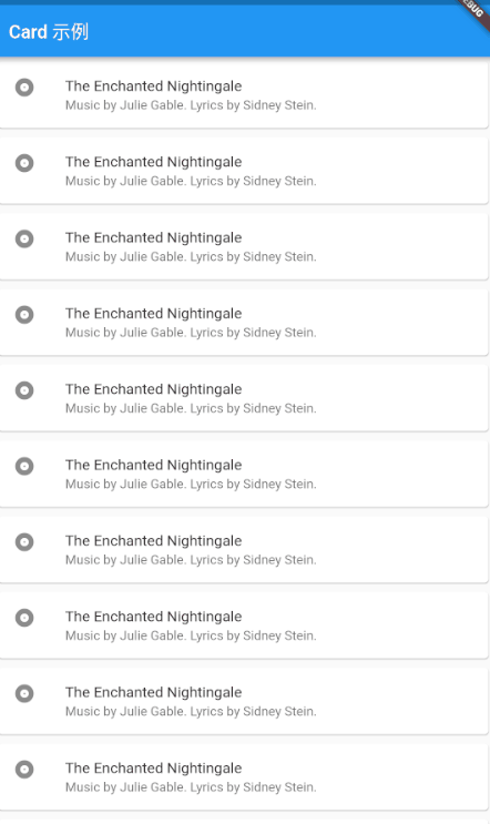
// This sample shows creation of a [Card] widget that shows album information
// and two actions.

import 'package:flutter/material.dart';

void main() => runApp(MyApp());

class MyApp extends StatelessWidget {
  // This widget is the root of your application.
  @override
  Widget build(BuildContext context) {
    return MaterialApp(
      title: 'Flutter Code Sample for material.Card',
      theme: ThemeData(
        primarySwatch: Colors.blue,
      ),
      home: Scaffold(
        appBar: AppBar(
          title: Text('Card 示例'),
        ),
        body: MyStatelessWidget(),
      ),
    );
  }
}

class MyStatelessWidget extends StatelessWidget {
  MyStatelessWidget({Key key}) : super(key: key);

  @override
  Widget build(BuildContext context) {
    return ListView.builder(itemBuilder: (context,index){
      return Card(
        margin: EdgeInsets.all(5.0),
        child: const ListTile(
          leading: Icon(Icons.album),
          title: Text('The Enchanted Nightingale'),
          subtitle: Text('Music by Julie Gable. Lyrics by Sidney Stein.'),
        ),
      );
    });
  }
}
LinearProgressIndicator
简介
一个线性进度条,另外还有一个圆形进度条 CircularProgressIndicator
常用属性
| 属性名 | 类型 | 说明 |
|---|---|---|
| backgroudColor | Color | 进度指示器的背景颜色。默认情况下,当前主题的ThemeData.backgroundColor。 |
简单示例
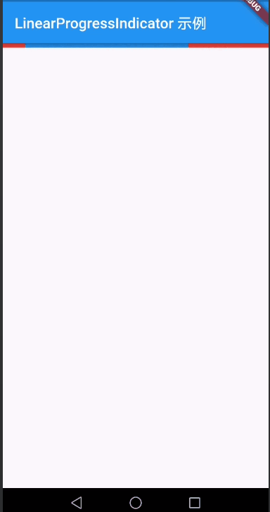
import 'package:flutter/material.dart';

void main()=>runApp(LinearProgressIndicatorPage());

class LinearProgressIndicatorPage extends StatefulWidget {
  @override
  _LinearProgressIndicatorPageState createState() => _LinearProgressIndicatorPageState();
}

class _LinearProgressIndicatorPageState extends State<LinearProgressIndicatorPage> {
  @override
  Widget build(BuildContext context) {
    return MaterialApp(
      home: Scaffold(
        appBar: AppBar(
          title: Text('LinearProgressIndicator 示例'),
        ),
        body: LinearProgressIndicator(
          backgroundColor: Colors.red,
        ),
      ),
    );
  }
}
布局
ListTile
简介
一个固定高度的行,通常包含一些文本,以及一个行前或行尾图标。
常用属性
| 属性名 | 类型 | 说明 |
|---|---|---|
| contentPadding | EdgeInsetsGeometry | 内部填充 |
| dense | bool | 此列表图块是否是垂直密集列表的一部分 |
| enable | bool | 此列表图块是否是交互式的 |
| isThreeLine | bool | 此列表图块是否旨在显示三行文本 |
| leading | Widget | 要在标题之前显示的小部件 |
| onLongPress | GestureTapCallback | 当用户长按此列表磁贴时调用 |
| onTap | GestureTapCallback | 当用户点击此列表磁贴时调用 |
| selected | bool | 如果此图块也已启用,则图标和文本将以相同颜色呈现 |
| title | Widget | 列表主要内容 |
| trailing | Widget | 标题后显示的小部件 |
| subtitle | Widget | 标题下方显示的其他内容 |
简单示例
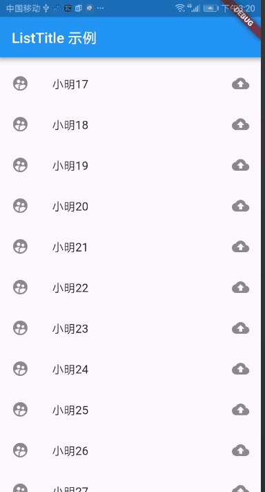
import 'package:flutter/material.dart';

void main() => runApp(MaterialApp(
      home: ListTitlePage(),
    ));

class ListTitlePage extends StatefulWidget {
  @override
  _ListTitlePageState createState() => _ListTitlePageState();
}

class _ListTitlePageState extends State<ListTitlePage> {
  @override
  Widget build(BuildContext context) {
    return Scaffold(
      appBar: AppBar(
        title: Text('ListTitle 示例'),
      ),
      body: ListView.builder(
          itemCount: 100,
          itemBuilder: (BuildContext context, int index) {
            return ListTile(
              leading: Icon(Icons.supervised_user_circle),
              title: Text('小明$index'),
              trailing: Icon(Icons.backup),
            );
          }),
    );
  }
}
Stepper
简介
一个 Material Design 步骤指示器,显示一系列步骤的过程
常用属性
| 属性名 | 类型 | 说明 |
|---|---|---|
| controlsBuilder | ControlsWidgetBuild | 用于创建自定义控件的回调 |
| currentStep | int | 显示内容的当前步骤的索引的索引 |
| onStepCancel | VoidCallback | 点击“取消”按钮时调用回调 |
| onStepTapped | ValueChanged | 回调一个步骤时调用的回调,其索引作为参数传递。 |
| physics | ScrollPhysics | 步进器的滚动视图应如何响应用户输入。 |
| steps | List | 步进器的步骤,标题,副标题,图标总是显示。 |
| type | StepperType | 确定布局的步进器类型。在StepperType.horizontal 的情况下,当前步骤的内容显示在下面,而不是StepperType.vertical 情况,其中显示在其间。 |
简单示例
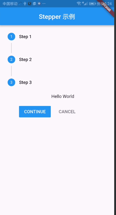
import 'package:flutter/material.dart';

void main() =>
    runApp(new MaterialApp(title: "Stepper 示例", home: new StepperPage()));

class StepperPage extends StatefulWidget {
  @override
  State<StatefulWidget> createState() => StepperPageState();
}

class StepperPageState extends State<StepperPage> {
  int current_step = 0;
  List<Step> my_steps = [
    new Step(
        title: new Text("Step 1"), content: new Text("Hello"), isActive: true),
    new Step(
        title: new Text("Step 2"), content: new Text("World"), isActive: true),
    new Step(
        title: new Text("Step 3"),
        content: new Text("Hello World"),
        isActive: true)
  ];
  @override
  Widget build(BuildContext context) {
    return new Scaffold(
      appBar:
      new AppBar(title: new Center(child: new Text("Stepper 示例"))),
      body: new Container(
        child: new Stepper(
          currentStep: this.current_step,
          steps: my_steps,
          type: StepperType.vertical,
          onStepTapped: (step) {
            setState(() {
              current_step = step;
            });
          },
          onStepCancel: () {
            setState(() {
              if (current_step > 0) {
                current_step = current_step - 1;
              } else {
                current_step = 0;
              }
            });
          },
          onStepContinue: () {
            setState(() {
              if (current_step < my_steps.length - 1) {
                current_step = current_step + 1;
              } else {
                current_step = 0;
              }
            });
          },
        ),
      ),
    );
  }
}
Divider
简介
一个逻辑1像素厚的水平分割线,两边都有填充
常用属性
| 属性名 | 类型 | 说明 |
|---|---|---|
| color | Color | 虚线的背景色 |
| height | double | 虚线的高度 |
| indent | double | 分隔左边的空白空间量 |
简单示例
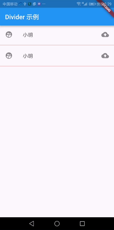
import 'package:flutter/material.dart';

void main() => runApp(MaterialApp(
      home: ListTitlePage(),
    ));

class ListTitlePage extends StatefulWidget {
  @override
  _ListTitlePageState createState() => _ListTitlePageState();
}

class _ListTitlePageState extends State<ListTitlePage> {
  @override
  Widget build(BuildContext context) {
    return Scaffold(
      appBar: AppBar(
        title: Text('Divider 示例'),
      ),
      body: Column(
        children: <Widget>[
          ListTile(
            leading: Icon(Icons.supervised_user_circle),
            title: Text('小明'),
            trailing: Icon(Icons.backup),
          ),
          Divider(
            height: 10.0,
            color: Color(0xffff0000),
          ),
          ListTile(
            leading: Icon(Icons.supervised_user_circle),
            title: Text('小明'),
            trailing: Icon(Icons.backup),
          ),
          Divider(
            height: 10.0,
            color: Color(0xffff0000),
          )
        ],
      ),
    );
  }
}
